Show code cell source
%matplotlib inline
import warnings

warnings.filterwarnings(
    "ignore",
    message="plotting functions contained within `_documentation_utils` are intended for nemos's documentation.",
    category=UserWarning,
)

warnings.filterwarnings(
    "ignore",
    message="Ignoring cached namespace 'core'",
    category=UserWarning,
)

warnings.filterwarnings(
    "ignore",
    message=(
        "invalid value encountered in div "
    ),
    category=RuntimeWarning,
)
Download
This notebook can be downloaded as head_direction.ipynb. See the button at the top right to download as markdown or pdf.
Fit head-direction population#
Learning objectives#
Include history-related predictors to NeMoS GLM.
Reduce over-fitting with
Basis.Learn functional connectivity.
import matplotlib.pyplot as plt
import numpy as np
import pynapple as nap

import nemos as nmo

# some helper plotting functions
from nemos import _documentation_utils as doc_plots
import workshop_utils

# configure pynapple to ignore conversion warning
nap.nap_config.suppress_conversion_warnings = True

# configure plots some
plt.style.use(nmo.styles.plot_style)
WARNING:2025-02-04 19:33:17,489:jax._src.xla_bridge:987: An NVIDIA GPU may be present on this machine, but a CUDA-enabled jaxlib is not installed. Falling back to cpu.
Data Streaming#
Here we load the data from OSF. The data is a NWB file.
path = workshop_utils.fetch.fetch_data("Mouse32-140822.nwb")
Pynapple#
We are going to open the NWB file with pynapple.
data = nap.load_file(path)

data
/home/agent/workspace/rorse_ccn-software-jan-2025_main/lib/python3.11/site-packages/hdmf/spec/namespace.py:535: UserWarning: Ignoring cached namespace 'hdmf-common' version 1.5.0 because version 1.8.0 is already loaded.
  warn("Ignoring cached namespace '%s' version %s because version %s is already loaded."
/home/agent/workspace/rorse_ccn-software-jan-2025_main/lib/python3.11/site-packages/hdmf/spec/namespace.py:535: UserWarning: Ignoring cached namespace 'hdmf-experimental' version 0.1.0 because version 0.5.0 is already loaded.
  warn("Ignoring cached namespace '%s' version %s because version %s is already loaded."
Mouse32-140822
┍━━━━━━━━━━━━━━━━━━━━━━━┯━━━━━━━━━━━━━┑
│ Keys                  │ Type        │
┝━━━━━━━━━━━━━━━━━━━━━━━┿━━━━━━━━━━━━━┥
│ units                 │ TsGroup     │
│ sws                   │ IntervalSet │
│ rem                   │ IntervalSet │
│ position_time_support │ IntervalSet │
│ epochs                │ IntervalSet │
│ ry                    │ Tsd         │
┕━━━━━━━━━━━━━━━━━━━━━━━┷━━━━━━━━━━━━━┙
Get spike timings
spikes = data["units"]

spikes
Index    rate     location    group
-------  -------  ----------  -------
0        2.96981  thalamus    1
1        2.42638  thalamus    1
2        5.93417  thalamus    1
3        5.04432  thalamus    1
4        0.30207  adn         2
5        0.87042  adn         2
6        0.36154  adn         2
...      ...      ...         ...
42       1.02061  thalamus    5
43       6.84913  thalamus    6
44       0.94002  thalamus    6
45       0.55768  thalamus    6
46       1.15056  thalamus    6
47       0.46084  thalamus    6
48       0.19287  thalamus    7
Get the behavioural epochs (in this case, sleep and wakefulness)
epochs = data["epochs"]
wake_epochs = epochs[epochs.tags == "wake"]
/home/agent/workspace/rorse_ccn-software-jan-2025_main/lib/python3.11/site-packages/pynapple/io/interface_nwb.py:90: UserWarning: DataFrame is not sorted by start times. Sorting it.
  data = nap.IntervalSet(df)
Get the tracked orientation of the animal
angle = data["ry"]
This cell will restrict the data to what we care about i.e. the activity of head-direction neurons during wakefulness.
spikes = spikes[spikes.location == "adn"]

spikes = spikes.restrict(wake_epochs).getby_threshold("rate", 1.0)
angle = angle.restrict(wake_epochs)
First let’s check that they are head-direction neurons.
tuning_curves = nap.compute_1d_tuning_curves(
    group=spikes, feature=angle, nb_bins=61, minmax=(0, 2 * np.pi)
)
Each row indicates an angular bin (in radians), and each column corresponds to a single unit. Let’s plot the tuning curve of the first two neurons.
fig, ax = plt.subplots(1, 2, figsize=(12, 4))
ax[0].plot(tuning_curves.iloc[:, 0])
ax[0].set_xlabel("Angle (rad)")
ax[0].set_ylabel("Firing rate (Hz)")
ax[1].plot(tuning_curves.iloc[:, 1])
ax[1].set_xlabel("Angle (rad)")
plt.tight_layout()
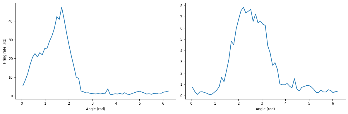
Before using NeMoS, let’s explore the data at the population level.
Let’s plot the preferred heading
fig = workshop_utils.plot_head_direction_tuning_model(
    tuning_curves, spikes, angle, threshold_hz=1, start=8910, end=8960
)
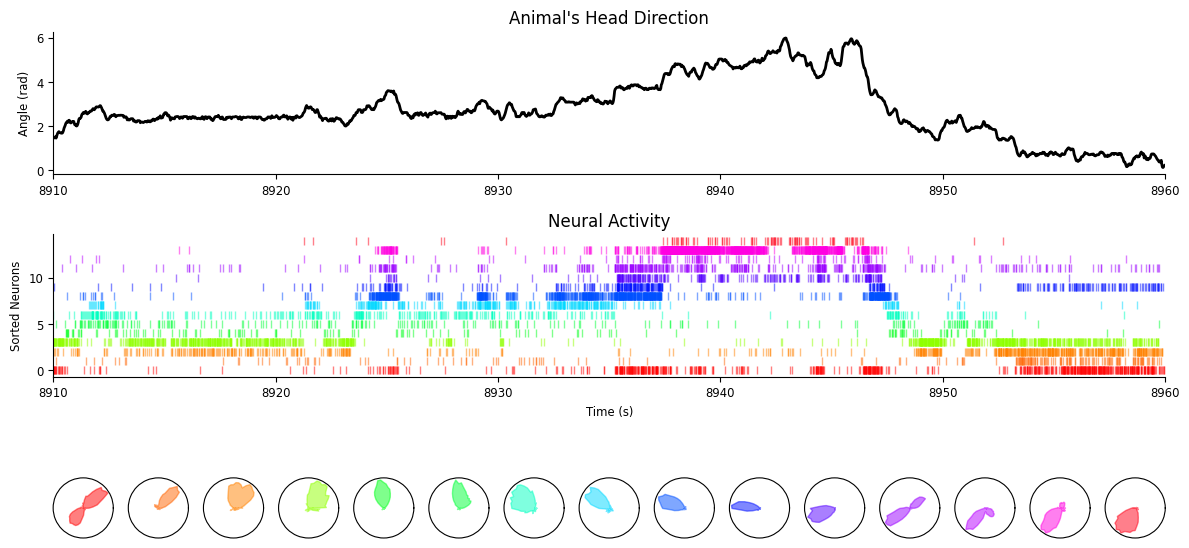
As we can see, the population activity tracks very well the current head-direction of the animal.
Question : are neurons constantly tuned to head-direction and can we use it to predict the spiking activity of each neuron based only on the activity of other neurons?
To fit the GLM faster, we will use only the first 3 min of wake.
wake_ep = nap.IntervalSet(
    start=wake_epochs.start[0], end=wake_epochs.start[0] + 3 * 60
)
To use the GLM, we need first to bin the spike trains. Here we use pynapple.
bin_size = 0.01
count = spikes.count(bin_size, ep=wake_ep)
Here we are going to rearrange neurons order based on their preferred directions.
pref_ang = tuning_curves.idxmax()

count = nap.TsdFrame(
    t=count.t,
    d=count.values[:, np.argsort(pref_ang.values)],
)
NeMoS#
It’s time to use NeMoS. Our goal is to estimate the pairwise interaction between neurons. This can be quantified with a GLM if we use the recent population spike history to predict the current time step.
Self-Connected Single Neuron#
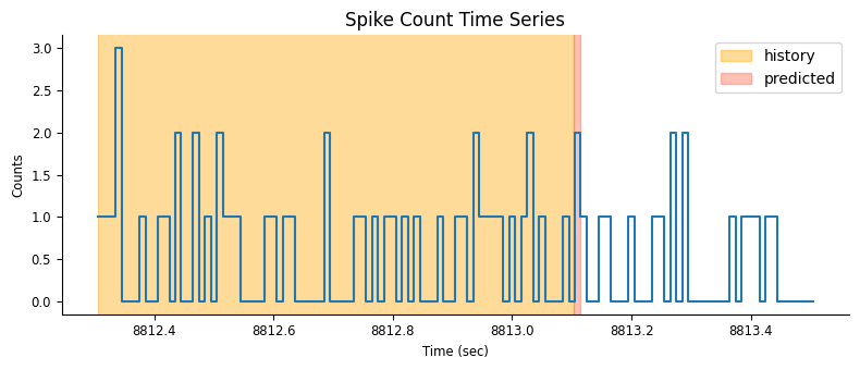
To simplify our life, let’s see first how we can model spike history effects in a single neuron. The simplest approach is to use counts in fixed length window \(i\), \(y_{t-i}, \dots, y_{t-1}\) to predict the next count \(y_{t}\).
Before starting the analysis, let’s select a neuron and a time window that we will use to visualize the model features.
# select a neuron's spike count time series
neuron_count = count[:, 0]

# restrict to a smaller time interval
epoch_one_spk = nap.IntervalSet(
    start=count.time_support.start[0], end=count.time_support.start[0] + 1.2
)
Features Construction#
Let’s fix the spike history window size that we will use as predictor.
# set the size of the spike history window in seconds
window_size_sec = 0.8

doc_plots.plot_history_window(neuron_count, epoch_one_spk, window_size_sec);
For each time point, we shift our window one bin at the time and vertically stack the spike count history in a matrix. Each row of the matrix will be used as the predictors for the rate in the next bin (red narrow rectangle in the figure).
doc_plots.run_animation(neuron_count, epoch_one_spk.start[0])
If \(t\) is smaller than the window size, we won’t have a full window of spike history for estimating the rate. One may think of padding the window (with zeros for example) but this may generate weird border artifacts. To avoid that, we can simply restrict our analysis to times \(t\) larger than the window and NaN-pad earlier time-points;
You can construct this feature matrix with the HistoryConv basis.
# convert the prediction window to bins (by multiplying with the sampling rate)
window_size = int(window_size_sec * neuron_count.rate)
# define the history bases
history_basis = nmo.basis.HistoryConv(window_size)
# create the feature matrix
input_feature = history_basis.compute_features(neuron_count)
/home/agent/workspace/rorse_ccn-software-jan-2025_main/lib/python3.11/site-packages/pynapple/core/time_series.py:300: DeprecationWarning: `newshape` keyword argument is deprecated, use `shape=...` or pass shape positionally instead. (deprecated in NumPy 2.1)
  out = func._implementation(*new_args, **kwargs)
# print the NaN indices along the time axis
print("NaN indices:\n", np.where(np.isnan(input_feature[:, 0]))[0])
NaN indices:
 [ 0  1  2  3  4  5  6  7  8  9 10 11 12 13 14 15 16 17 18 19 20 21 22 23
 24 25 26 27 28 29 30 31 32 33 34 35 36 37 38 39 40 41 42 43 44 45 46 47
 48 49 50 51 52 53 54 55 56 57 58 59 60 61 62 63 64 65 66 67 68 69 70 71
 72 73 74 75 76 77 78 79]
The binned counts originally have shape “number of samples”, we should check that the dimension are matching our expectation
print(f"Time bins in counts: {neuron_count.shape[0]}")
print(f"Convolution window size in bins: {window_size}")
print(f"Feature shape: {input_feature.shape}")
print(f"Feature shape: {input_feature.shape}")
Time bins in counts: 18000
Convolution window size in bins: 80
Feature shape: (18000, 80)
Feature shape: (18000, 80)
We can visualize the output for a few time bins
suptitle = "Input feature: Count History"
neuron_id = 0
workshop_utils.plot_features(input_feature, count.rate, suptitle);
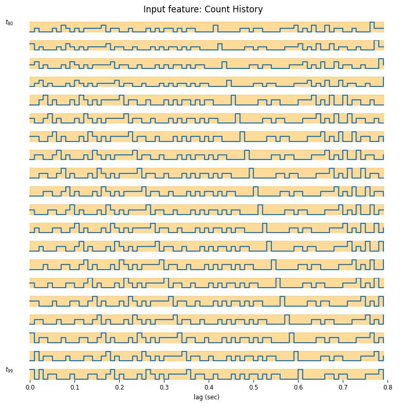
As you may see, the time axis is backward, this happens because under the hood, the basis is using the convolution operator which flips the time axis. This is equivalent, as we can interpret the result as how much a spike will affect the future rate. In the previous tutorial our feature was 1-dimensional (just the current), now instead the feature dimension is 80, because our bin size was 0.01 sec and the window size is 0.8 sec. We can learn these weights by maximum likelihood by fitting a GLM.
Fitting the Model#
When working a real dataset, it is good practice to train your models on a chunk of the data and use the other chunk to assess the model performance. This process is known as “cross-validation”. There is no unique strategy on how to cross-validate your model; What works best depends on the characteristic of your data (time series or independent samples, presence or absence of trials…), and that of your model. Here, for simplicity use the first half of the wake epochs for training and the second half for testing. This is a reasonable choice if the statistics of the neural activity does not change during the course of the recording. We will learn about better cross-validation strategies with other examples.
# construct the train and test epochs
duration = input_feature.time_support.tot_length("s")
start = input_feature.time_support["start"]
end = input_feature.time_support["end"]

# define the interval sets
first_half = nap.IntervalSet(start, start + duration / 2)
second_half = nap.IntervalSet(start + duration / 2, end)
Fit the glm to the first half of the recording and visualize the maximum likelihood weights.
# define the GLM object
model = nmo.glm.GLM(solver_name="LBFGS")

# Fit over the training epochs
model.fit(
    input_feature.restrict(first_half),
    neuron_count.restrict(first_half)
)
GLM(
    observation_model=PoissonObservations(inverse_link_function=exp),
    regularizer=UnRegularized(),
    solver_name='LBFGS'
)
plt.figure()
plt.title("Spike History Weights")
plt.plot(np.arange(window_size) / count.rate, np.squeeze(model.coef_), lw=2, label="GLM raw history 1st Half")
plt.axhline(0, color="k", lw=0.5)
plt.xlabel("Time From Spike (sec)")
plt.ylabel("Kernel")
plt.legend()
<matplotlib.legend.Legend at 0x7f00004a13d0>
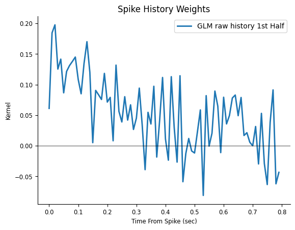
The response in the previous figure seems noise added to a decay, therefore the response can be described with fewer degrees of freedom. In other words, it looks like we are using way too many weights to describe a simple response. If we are correct, what would happen if we re-fit the weights on the other half of the data?
Inspecting the results#
# fit on the test set

model_second_half = nmo.glm.GLM(solver_name="LBFGS")
model_second_half.fit(
    input_feature.restrict(second_half),
    neuron_count.restrict(second_half)
)
GLM(
    observation_model=PoissonObservations(inverse_link_function=exp),
    regularizer=UnRegularized(),
    solver_name='LBFGS'
)
plt.figure()
plt.title("Spike History Weights")
plt.plot(np.arange(window_size) / count.rate, np.squeeze(model.coef_),
         label="GLM raw history 1st Half", lw=2)
plt.plot(np.arange(window_size) / count.rate,  np.squeeze(model_second_half.coef_),
         color="orange", label="GLM raw history 2nd Half", lw=2)
plt.axhline(0, color="k", lw=0.5)
plt.xlabel("Time From Spike (sec)")
plt.ylabel("Kernel")
plt.legend()
<matplotlib.legend.Legend at 0x7eff9c0a17d0>
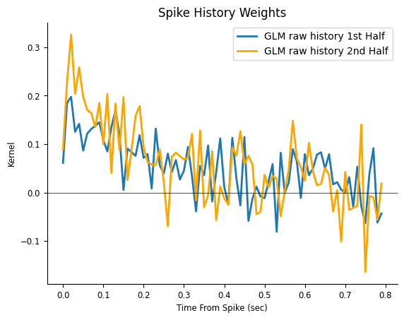
What can we conclude?
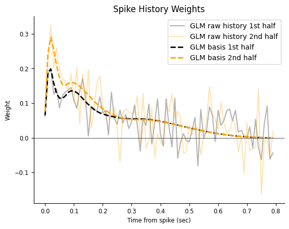
The fast fluctuations are inconsistent across fits, indicating that they are probably capturing noise, a phenomenon known as over-fitting; On the other hand, the decaying trend is fairly consistent, even if our estimate is noisy. You can imagine how things could get worst if we needed a finer temporal resolution, such 1ms time bins (which would require 800 coefficients instead of 80). What can we do to mitigate over-fitting now?
Reducing feature dimensionality#
Let’s see how to use NeMoS’ basis module to reduce dimensionality and avoid over-fitting!
For history-type inputs, we’ll use again the raised cosine log-stretched basis,
Pillow et al., 2005.
doc_plots.plot_basis();
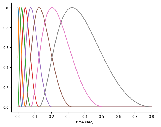
Note
We provide a handful of different choices for basis functions, and selecting the proper basis function for your input is an important analytical step. We will eventually provide guidance on this choice, but for now we’ll give you a decent choice.
We can initialize the RaisedCosineLogConv by providing the number of basis functions and the window size for the convolution. With more basis functions, we’ll be able to represent the effect of the corresponding input with the higher precision, at the cost of adding additional parameters.
# a basis object can be instantiated in "conv" mode for convolving  the input.
basis = nmo.basis.RaisedCosineLogConv(
    n_basis_funcs=8, window_size=window_size
)
Our spike history predictor was huge: every possible 80 time point chunk of the data, for \(144 \cdot 10^4\) total numbers. By using this basis set we can instead reduce the predictor to 8 numbers for every 80 time point window for \(144 \cdot 10^3\) total numbers, an order of magnitude less. With 1ms bins we would have achieved 2 order of magnitude reduction in input size. This is a huge benefit in terms of memory allocation and, computing time. As an additional benefit, we will reduce over-fitting.
Let’s see our basis in action. We can “compress” spike history feature by convolving the basis
with the counts (without creating the large spike history feature matrix).
This can be performed in NeMoS by calling the compute_features method of basis.
# equivalent to
# `nmo.convolve.create_convolutional_predictor(basis_kernels, neuron_count)`
conv_spk = basis.compute_features(neuron_count)

print(f"Raw count history as feature: {input_feature.shape}")
print(f"Compressed count history as feature: {conv_spk.shape}")
Raw count history as feature: (18000, 80)
Compressed count history as feature: (18000, 8)
/home/agent/workspace/rorse_ccn-software-jan-2025_main/lib/python3.11/site-packages/pynapple/core/time_series.py:300: DeprecationWarning: `newshape` keyword argument is deprecated, use `shape=...` or pass shape positionally instead. (deprecated in NumPy 2.1)
  out = func._implementation(*new_args, **kwargs)
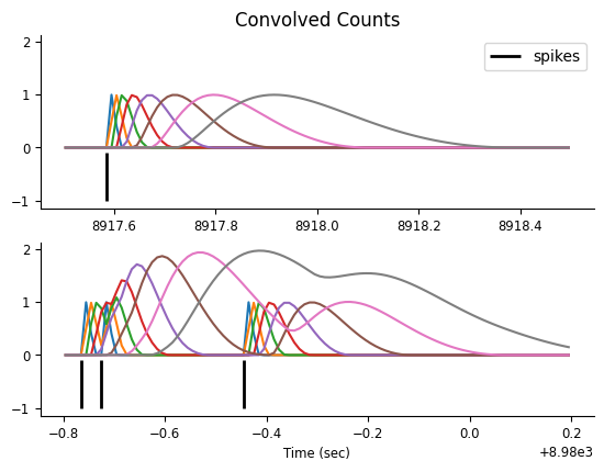
Let’s focus on two small time windows and visualize the features, which result from convolving the counts with the basis elements.
# Visualize the convolution results
epoch_one_spk = nap.IntervalSet(8917.5, 8918.5)
epoch_multi_spk = nap.IntervalSet(8979.2, 8980.2)

doc_plots.plot_convolved_counts(neuron_count, conv_spk, epoch_one_spk, epoch_multi_spk);
Now that we have our “compressed” history feature matrix, we can fit the ML parameters for a GLM.
Fit and compare the models#
# use restrict on interval set training
model_basis = nmo.glm.GLM(solver_name="LBFGS")
model_basis.fit(conv_spk.restrict(first_half), neuron_count.restrict(first_half))
GLM(
    observation_model=PoissonObservations(inverse_link_function=exp),
    regularizer=UnRegularized(),
    solver_name='LBFGS'
)
We can plot the resulting response, noting that the weights we just learned needs to be “expanded” back
to the original window_size dimension by multiplying them with the basis kernels.
We have now 8 coefficients,
print(model_basis.coef_)
[ 0.00699737  0.11532708  0.11950959  0.02769178  0.06939367  0.08511728
 -0.00209078  0.05547396]
In order to get the response we need to multiply the coefficients by their corresponding basis function, and sum them.
# get the basis function kernels
_, basis_kernels = basis.evaluate_on_grid(window_size)

# multiply with the weights
self_connection = np.matmul(basis_kernels, model_basis.coef_)

print(self_connection.shape)
(80,)
Let’s check if our new estimate does a better job in terms of over-fitting. We can do that by visual comparison, as we did previously. Let’s fit the second half of the dataset.
model_basis_second_half = nmo.glm.GLM(solver_name="LBFGS").fit(
    conv_spk.restrict(second_half), neuron_count.restrict(second_half)
)
Get the response filters.
self_connection_second_half = np.matmul(basis_kernels, model_basis_second_half.coef_)
And plot the results.
time = np.arange(window_size) / count.rate
plt.figure()
plt.title("Spike History Weights")
plt.plot(time, np.squeeze(model.coef_), "k", alpha=0.3, label="GLM raw history 1st half")
plt.plot(time, np.squeeze(model_second_half.coef_), alpha=0.3, color="orange", label="GLM raw history 2nd half")
plt.plot(time, self_connection, "--k", lw=2, label="GLM basis 1st half")
plt.plot(time, self_connection_second_half, color="orange", lw=2, ls="--", label="GLM basis 2nd half")
plt.axhline(0, color="k", lw=0.5)
plt.xlabel("Time from spike (sec)")
plt.ylabel("Weight")
plt.legend()
<matplotlib.legend.Legend at 0x7efff05645d0>
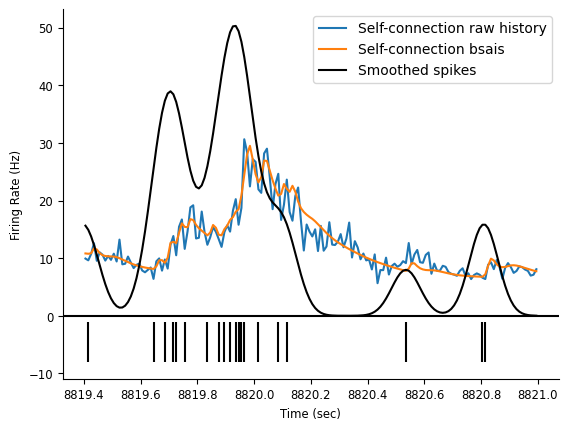
Let’s extract the firing rate.
rate_basis = model_basis.predict(conv_spk) * conv_spk.rate
rate_history = model.predict(input_feature) * conv_spk.rate
And plot it.
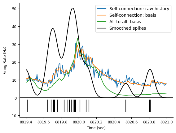
ep = nap.IntervalSet(start=8819.4, end=8821)
# plot the rates
doc_plots.plot_rates_and_smoothed_counts(
    neuron_count,
    {"Self-connection raw history":rate_history, "Self-connection bsais": rate_basis}
);
All-to-all Connectivity#
The same approach can be applied to the whole population. Now the firing rate of a neuron
is predicted not only by its own count history, but also by the rest of the
simultaneously recorded population. We can convolve the basis with the counts of each neuron
to get an array of predictors of shape, (num_time_points, num_neurons * num_basis_funcs).
Preparing the features#
Since this time we are convolving more than one neuron, we need to reset the expected input shape. This can be done by passing the population counts to the set_input_shape method.
# reset the input shape by passing the pop. count
basis.set_input_shape(count)

# convolve all the neurons
convolved_count = basis.compute_features(count)
/home/agent/workspace/rorse_ccn-software-jan-2025_main/lib/python3.11/site-packages/pynapple/core/time_series.py:300: DeprecationWarning: `newshape` keyword argument is deprecated, use `shape=...` or pass shape positionally instead. (deprecated in NumPy 2.1)
  out = func._implementation(*new_args, **kwargs)
Check the dimension to make sure it make sense Shape should be (n_samples, n_basis_func * n_neurons)
print(f"Convolved count shape: {convolved_count.shape}")
Convolved count shape: (18000, 152)
Fitting the Model#
This is an all-to-all neurons model.
We are using the class PopulationGLM to fit the whole population at once.
Note
Once we condition on past activity, log-likelihood of the population is the sum of the log-likelihood of individual neurons. Maximizing the sum (i.e. the population log-likelihood) is equivalent to maximizing each individual term separately (i.e. fitting one neuron at the time).
model = nmo.glm.PopulationGLM(
    regularizer="Ridge",
    solver_name="LBFGS",
    regularizer_strength=0.1
    ).fit(convolved_count, count)

print(f"Model coefficients shape: {model.coef_.shape}")
Model coefficients shape: (152, 19)
Comparing model predictions.#
Predict the rate (counts are already sorted by tuning prefs)
predicted_firing_rate = model.predict(convolved_count) * conv_spk.rate
Plot fit predictions over a short window not used for training.
# use pynapple for time axis for all variables plotted for tick labels in imshow
workshop_utils.plot_head_direction_tuning_model(tuning_curves, spikes, angle,
                                                predicted_firing_rate, threshold_hz=1,
                                                start=8910, end=8960, cmap_label="hsv");
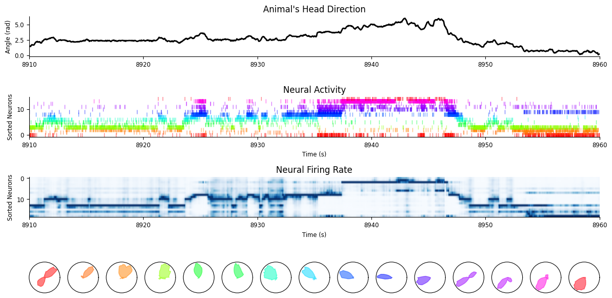
Let’s see if our firing rate predictions improved and in what sense.
fig = doc_plots.plot_rates_and_smoothed_counts(
    neuron_count,
    {"Self-connection: raw history": rate_history,
     "Self-connection: bsais": rate_basis,
     "All-to-all: basis": predicted_firing_rate[:, 0]}
)
Visualizing the connectivity#
Extract the weights and store it in a (n_neurons, n_neurons, n_basis_funcs) array.
# original shape of the weights
print(f"GLM coeff: {model.coef_.shape}")
GLM coeff: (152, 19)
You can use the split_by_feature method of basis for this.
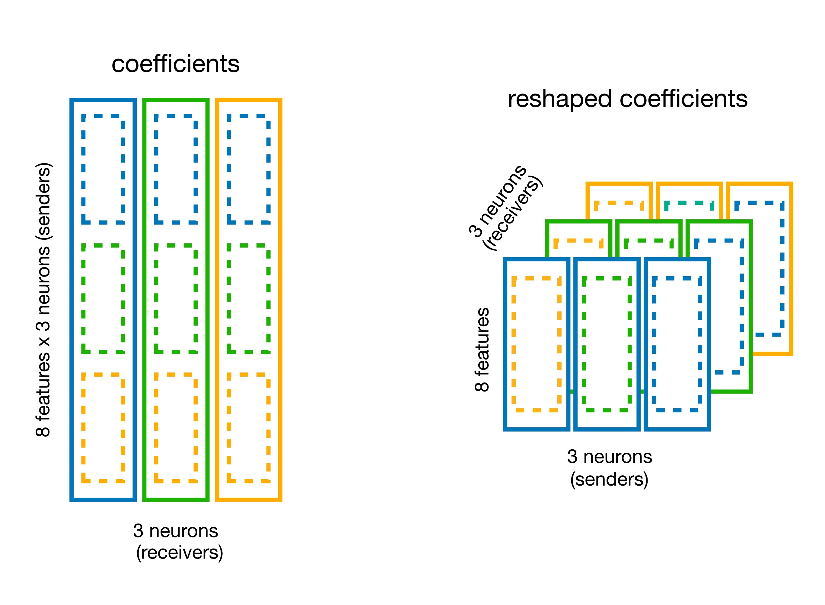
# split the coefficient vector along the feature axis (axis=0)
weights_dict = basis.split_by_feature(model.coef_, axis=0)

# the output is a dict with key the basis label,
# and value the reshaped coefficients
weights = weights_dict["RaisedCosineLogConv"]
print(f"Re-shaped coeff: {weights.shape}")
Re-shaped coeff: (19, 8, 19)
Multiply the weights by the basis, to get the history filters.
responses = np.einsum("jki,tk->ijt", weights, basis_kernels)

print(responses.shape)
(19, 19, 80)
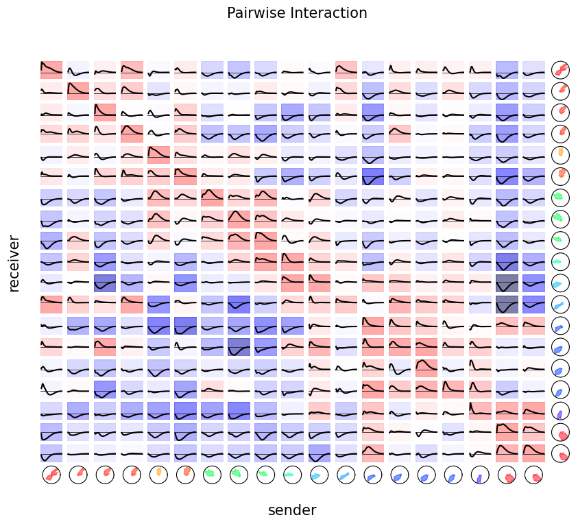
Finally, we can visualize the pairwise interactions by plotting all the coupling filters.
tuning = nap.compute_1d_tuning_curves_continuous(predicted_firing_rate,
                                                 feature=angle,
                                                 nb_bins=61,
                                                 minmax=(0, 2 * np.pi))

fig = doc_plots.plot_coupling(responses, tuning)