Show code cell source
%matplotlib inline
%load_ext autoreload
%autoreload 2
import warnings

warnings.filterwarnings(
    "ignore",
    message="plotting functions contained within `_documentation_utils` are intended for nemos's documentation.",
    category=UserWarning,
)

warnings.filterwarnings(
    "ignore",
    message="Ignoring cached namespace 'core'",
    category=UserWarning,
)

warnings.filterwarnings(
    "ignore",
    message=(
        "invalid value encountered in div "
    ),
    category=RuntimeWarning,
)
Download
This notebook can be downloaded as current_injection.ipynb. See the button at the top right to download as markdown or pdf.
Introduction to GLM#
For our first example, we will look at a very simple dataset: patch-clamp recordings from a single neuron in layer 4 of mouse primary visual cortex. This data is from the Allen Brain Atlas, and experimenters injected current directly into the cell, while recording the neuron’s membrane potential and spiking behavior. The experiments varied the shape of the current across many sweeps, mapping the neuron’s behavior in response to a wide range of potential inputs.
For our purposes, we will examine only one of these sweeps, “Noise 1”, in which the experimentalists injected three pulses of current. The current is a square pulse multiplied by a sinusoid of a fixed frequency, with some random noise riding on top.
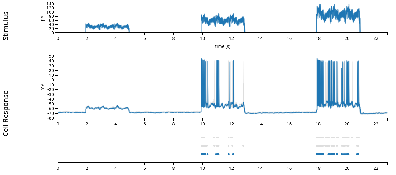
In the figure above (from the Allen Brain Atlas website), we see the approximately 22 second sweep, with the input current plotted in the first row, the intracellular voltage in the second, and the recorded spikes in the third. (The grey lines and dots in the second and third rows comes from other sweeps with the same stimulus, which we’ll ignore in this exercise.) When fitting the Generalized Linear Model, we are attempting to model the spiking behavior, and we generally do not have access to the intracellular voltage, so for the rest of this notebook, we’ll use only the input current and the recorded spikes displayed in the first and third rows.
First, let us see how to load in the data and reproduce the above figure, which we’ll do using pynapple. This will largely be a review of what we went through yesterday. After we’ve explored the data some, we’ll introduce the Generalized Linear Model and how to fit it with NeMoS.
Learning objectives#
Learn how to explore spiking data and do basic analyses using pynapple
Learn how to structure data for NeMoS
Learn how to fit a basic Generalized Linear Model using NeMoS
Learn how to retrieve the parameters and predictions from a fit GLM for intrepetation.
# Import everything
import jax
import matplotlib.pyplot as plt
import numpy as np
import pynapple as nap

import nemos as nmo

# some helper plotting functions
from nemos import _documentation_utils as doc_plots
import workshop_utils

# configure plots some
plt.style.use(nmo.styles.plot_style)
WARNING:2025-02-04 19:32:46,093:jax._src.xla_bridge:987: An NVIDIA GPU may be present on this machine, but a CUDA-enabled jaxlib is not installed. Falling back to cpu.
Data Streaming#
While you can download the data directly from the Allen Brain Atlas and interact with it using their AllenSDK, we prefer the burgeoning Neurodata Without Borders (NWB) standard. We have converted this single dataset to NWB and uploaded it to the Open Science Framework. This allows us to easily load the data using pynapple, and it will immediately be in a format that pynapple understands!
Tip
Pynapple can stream any NWB-formatted dataset! See their documentation for more details, and see the DANDI Archive for a repository of compliant datasets.
The first time the following cell is run, it will take a little bit of time to download the data, and a progress bar will show the download’s progress. On subsequent runs, the cell gets skipped: we do not need to redownload the data.
path = workshop_utils.fetch_data("allen_478498617.nwb")
Downloading file 'allen_478498617.nwb' from 'https://osf.io/vf2nj/download' to '/home/agent/workspace/rorse_ccn-software-jan-2025_main/lib/python3.11/data'.
Pynapple#
Data structures and preparation#
Now that we’ve downloaded the data, let’s open it with pynapple and examine its contents.
data = nap.load_file(path)
print(data)
/home/agent/workspace/rorse_ccn-software-jan-2025_main/lib/python3.11/site-packages/hdmf/spec/namespace.py:535: UserWarning: Ignoring cached namespace 'hdmf-common' version 1.7.0 because version 1.8.0 is already loaded.
  warn("Ignoring cached namespace '%s' version %s because version %s is already loaded."
/home/agent/workspace/rorse_ccn-software-jan-2025_main/lib/python3.11/site-packages/hdmf/spec/namespace.py:535: UserWarning: Ignoring cached namespace 'hdmf-experimental' version 0.4.0 because version 0.5.0 is already loaded.
  warn("Ignoring cached namespace '%s' version %s because version %s is already loaded."
allen_478498617
┍━━━━━━━━━━┯━━━━━━━━━━━━━┑
│ Keys     │ Type        │
┝━━━━━━━━━━┿━━━━━━━━━━━━━┥
│ units    │ TsGroup     │
│ epochs   │ IntervalSet │
│ stimulus │ Tsd         │
│ response │ Tsd         │
┕━━━━━━━━━━┷━━━━━━━━━━━━━┙
The dataset contains several different pynapple objects, which we will explore throughout this demo. The following illustrates how these fields relate to the data we visualized above:
stimulus: injected current, in Amperes, sampled at 20k Hz.response: the neuron’s intracellular voltage, sampled at 20k Hz. We will not use this info in this example.units: dictionary of neurons, holding each neuron’s spike timestamps.epochs: start and end times of different intervals, defining the experimental structure, specifying when each stimulation protocol began and ended.
Now let’s go through the relevant variables in some more detail:
trial_interval_set = data["epochs"]

current = data["stimulus"]
spikes = data["units"]
First, let’s examine trial_interval_set:
trial_interval_set
index    start    end      tags
0        0.0      34.02    ['Ramp']
1        39.02    73.04    ['Ramp']
2        78.04    112.06   ['Ramp']
3        117.06   119.083  ['Short Square']
4        124.083  126.106  ['Short Square']
5        131.106  133.129  ['Short Square']
6        138.129  140.152  ['Short Square']
...      ...      ...      ...
60       0.0      34.02    ['Short Square - Triple']
61       39.02    73.04    ['Short Square - Triple']
62       78.04    112.06   ['Short Square - Triple']
63       117.06   119.083  ['Short Square - Triple']
64       124.083  126.106  ['Short Square - Triple']
65       131.106  133.129  ['Short Square - Triple']
66       138.129  140.152  ['Test']
shape: (67, 2), time unit: sec.
trial_interval_set is an
IntervalSet,
with a metadata columns (tags) defining the stimulus protocol.
noise_interval = trial_interval_set[trial_interval_set.tags == "Noise 1"]
noise_interval
  index    start      end  tags
      0  460.768  488.788  ['Noise 1']
      1  526.808  554.828  ['Noise 1']
      2  592.848  620.868  ['Noise 1']
shape: (3, 2), time unit: sec.
As described above, we will be examining “Noise 1”. We can see it contains three rows, each defining a separate sweep. We’ll just grab the first sweep (shown in blue in the pictures above) and ignore the other two (shown in gray).
noise_interval = noise_interval[0]
noise_interval
  index    start      end  tags
      0  460.768  488.788  Noise 1
shape: (1, 2), time unit: sec.
Now let’s examine current:
current
Time (s)
-------------  --
0.0             0
5e-05           0
0.0001          0
0.00015         0
0.0002          0
0.00025         0
0.0003          0
...
897.420649999   0
897.420699999   0
897.420749999   0
897.420799999   0
897.420849999   0
897.420899999   0
897.420949999   0
dtype: float64, shape: (11348420,)
current is a Tsd
(TimeSeriesData)
object with 2 columns. Like all Tsd objects, the first column contains the
time index and the second column contains the data; in this case, the current
in Ampere (A).
Currently, current contains the entire ~900 second experiment but, as
discussed above, we only want one of the “Noise 1” sweeps. Fortunately,
pynapple makes it easy to grab out the relevant time points by making use
of the noise_interval we defined above:
current = current.restrict(noise_interval)
# convert current from Ampere to pico-amperes, to match the above visualization
# and move the values to a more reasonable range.
current = current * 1e12
current
Time (s)
-------------  --
460.768         0
460.76805       0
460.7681        0
460.76815       0
460.7682        0
460.76825       0
460.7683        0
...
488.787649993   0
488.787699993   0
488.787749993   0
488.787799993   0
488.787849993   0
488.787899993   0
488.787949993   0
dtype: float64, shape: (560400,)
Notice that the timestamps have changed and our shape is much smaller.
Finally, let’s examine the spike times. spikes is a
TsGroup,
a dictionary-like object that holds multiple Ts (timeseries) objects with
potentially different time indices:
spikes
  Index     rate  location      group
-------  -------  ----------  -------
      0  0.87805  v1                0
Typically, this is used to hold onto the spike times for a population of neurons. In this experiment, we only have recordings from a single neuron, so there’s only one row.
We can index into the TsGroup to see the timestamps for this neuron’s
spikes:
spikes[0]
Time (s)
1.85082
2.06869
2.20292
2.325815
2.42342
2.521415
2.604795
...
869.461695
878.08481
878.09765
878.110865
886.75375
886.761465
886.76995
shape: 777
Similar to current, this object originally contains data from the entire
experiment. To get only the data we need, we again use
restrict(noise_interval):
spikes = spikes.restrict(noise_interval)
print(spikes)
spikes[0]
  Index     rate  location      group
-------  -------  ----------  -------
      0  1.42755  v1                0
Time (s)
470.81754
470.85842
470.907235
470.954925
471.0074
471.107175
471.25083
...
480.67927
480.81817
480.90529
480.94921
481.002715
481.60008
481.67727
shape: 40
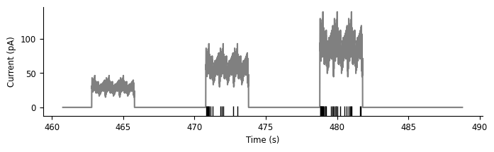
Now, let’s visualize the data from this trial, replicating rows 1 and 3 from the Allen Brain Atlas figure at the beginning of this notebook:
fig, ax = plt.subplots(1, 1, figsize=(8, 2))
ax.plot(current, "grey")
ax.plot(spikes.to_tsd([-5]), "|", color="k", ms = 10)
ax.set_ylabel("Current (pA)")
ax.set_xlabel("Time (s)")
Text(0.5, 0, 'Time (s)')
Basic analyses#
Before using the Generalized Linear Model, or any model, it’s worth taking some time to examine our data and think about what features are interesting and worth capturing. As Edoardo explained earlier today, the GLM is a model of the neuronal firing rate. However, in our experiments, we do not observe the firing rate, only the spikes! Moreover, neural responses are typically noisy—even in this highly controlled experiment where the same current was injected over multiple trials, the spike times were slightly different from trial-to-trial. No model can perfectly predict spike times on an individual trial, so how do we tell if our model is doing a good job?
Our objective function is the log-likelihood of the observed spikes given the predicted firing rate. That is, we’re trying to find the firing rate, as a function of time, for which the observed spikes are likely. Intuitively, this makes sense: the firing rate should be high where there are many spikes, and vice versa. However, it can be difficult to figure out if your model is doing a good job by squinting at the observed spikes and the predicted firing rates plotted together.
One common way to visualize a rough estimate of firing rate is to smooth the spikes by convolving them with a Gaussian filter.
Note
This is a heuristic for getting the firing rate, and shouldn’t be taken as the literal truth (to see why, pass a firing rate through a Poisson process to generate spikes and then smooth the output to approximate the generating firing rate). A model should not be expected to match this approximate firing rate exactly, but visualizing the two firing rates together can help you reason about which phenomena in your data the model is able to adequately capture, and which it is missing.
For more information, see section 1.2 of Theoretical Neuroscience, by Dayan and Abbott.
Pynapple can easily compute this approximate firing rate, and plotting this information will help us pull out some phenomena that we think are interesting and would like a model to capture.
First, we must convert from our spike times to binned spikes:
count: count the number of events withinbin_size
# bin size in seconds
bin_size = 0.001
# Get spikes for neuron 0
count = spikes[0].count(bin_size)
count
Time (s)
----------  --
460.7685     0
460.7695     0
460.7705     0
460.7715     0
460.7725     0
460.7735     0
460.7745     0
...
488.7815     0
488.7825     0
488.7835     0
488.7845     0
488.7855     0
488.7865     0
488.7875     0
dtype: int64, shape: (28020,)
Now, let’s convert the binned spikes into the firing rate, by smoothing them with a gaussian kernel. Pynapple again provides a convenience function for this:
smooth: convolve with a Gaussian kernel
# the inputs to this function are the standard deviation of the gaussian in seconds and
# the full width of the window, in standard deviations. So std=.05 and size_factor=20
# gives a total filter size of 0.05 sec * 20 = 1 sec.
firing_rate = count.smooth(std=0.05, size_factor=20)
# convert from spikes per bin to spikes per second (Hz)
firing_rate = firing_rate / bin_size
Note that firing_rate is a Tsd!
print(type(firing_rate))
<class 'pynapple.core.time_series.Tsd'>
Now that we’ve done all this preparation, let’s make a plot to more easily visualize the data.
Note
We’re hiding the details of the plotting function for the purposes of this tutorial, but you can find it in the source code if you are interested.
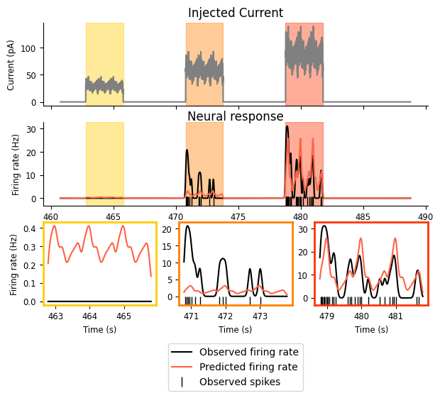
doc_plots.current_injection_plot(current, spikes, firing_rate);
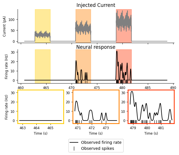
So now that we can view the details of our experiment a little more clearly, what do we see?
We have three intervals of increasing current, and the firing rate increases as the current does.
While the neuron is receiving the input, it does not fire continuously or at a steady rate; there appears to be some periodicity in the response. The neuron fires for a while, stops, and then starts again. There’s periodicity in the input as well, so this pattern in the response might be reflecting that.
There’s some decay in firing rate as the input remains on: there are three or four “bumps” of neuronal firing in the second and third intervals and they decrease in amplitude, with the first being the largest.
These give us some good phenomena to try and predict! But there’s something that’s not quite obvious from the above plot: what is the relationship between the input and the firing rate? As described in the first bullet point above, it looks to be monotonically increasing: as the current increases, so does the firing rate. But is that exactly true? What form is that relationship?
Pynapple can compute a tuning curve to help us answer this question, by binning our spikes based on the instantaneous input current and computing the firing rate within those bins:
Tuning curve in pynapple
compute_1d_tuning_curves : compute the firing rate as a function of a 1-dimensional feature.
tuning_curve = nap.compute_1d_tuning_curves(spikes, current, nb_bins=15)
tuning_curve
| 0 | |
|---|---|
| 4.637500 | 0.000000 |
| 13.912500 | 0.000000 |
| 23.187501 | 0.000000 |
| 32.462501 | 0.000000 |
| 41.737501 | 0.000000 |
| 51.012501 | 0.000000 |
| 60.287501 | 3.960592 |
| 69.562502 | 1.755310 |
| 78.837502 | 4.294610 |
| 88.112502 | 10.993325 |
| 97.387502 | 12.501116 |
| 106.662502 | 10.275380 |
| 115.937503 | 33.476805 |
| 125.212503 | 61.585835 |
| 134.487503 | 24.067389 |
tuning_curve is a pandas DataFrame where each column is a neuron (one
neuron in this case) and each row is a bin over the feature (here, the input
current). We can easily plot the tuning curve of the neuron:
doc_plots.tuning_curve_plot(tuning_curve);
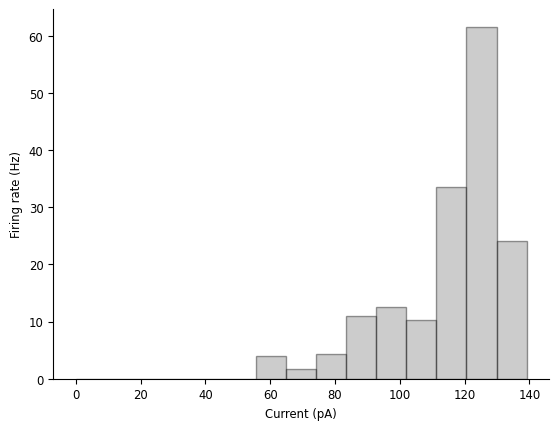
We can see that, while the firing rate mostly increases with the current, it’s definitely not a linear relationship, and it might start decreasing as the current gets too large.
So this gives us three interesting phenomena we’d like our model to help explain:
the tuning curve between the firing rate and the current.
the firing rate’s periodicity.
the gradual reduction in firing rate while the current remains on.
NeMoS#
Preparing data#
Now that we understand our data, we’re almost ready to put the model together. Before we construct it, however, we need to get the data into the right format.
When fitting a single neuron, NeMoS requires that the predictors and spike counts it operates on have the following properties:
predictors and spike counts must have the same number of time points.
predictors must be two-dimensional, with shape
(n_time_bins, n_features). In this example, we have a single feature (the injected current).spike counts must be one-dimensional, with shape
(n_time_bins, ). As discussed above,n_time_binsmust be the same for both the predictors and spike counts.predictors and spike counts must be
jax.numpyarrays,numpyarrays orpynappleTsdFrame/Tsd.
What is jax?
jax is a Google-supported python library for automatic differentiation. It has all sorts of neat features, but the most relevant of which for NeMoS is its GPU-compatibility and just-in-time compilation (both of which make code faster with little overhead!), as well as the collection of optimizers present in jaxopt.
First, we require that our predictors and our spike counts have the same
number of time bins. We can achieve this by down-sampling our current to the
spike counts to the proper resolution using the
bin_average
method from pynapple:
predictors and spikes must have same number of time points
binned_current = current.bin_average(bin_size)

print(f"current shape: {binned_current.shape}")
# rate is in Hz, convert to KHz
print(f"current sampling rate: {binned_current.rate/1000.:.02f} KHz")

print(f"\ncount shape: {count.shape}")
print(f"count sampling rate: {count.rate/1000:.02f} KHz")
current shape: (28020,)
current sampling rate: 1.00 KHz

count shape: (28020,)
count sampling rate: 1.00 KHz
Secondly, we have to reshape our variables so that they are the proper shape:
predictors:(n_time_bins, n_features)count:(n_time_bins, )
Because we only have a single predictor feature, we’ll use
np.expand_dims
to ensure it is a 2d array.
predictor = np.expand_dims(binned_current, 1)

# check that the dimensionality matches NeMoS expectation
print(f"predictor shape: {predictor.shape}")
print(f"count shape: {count.shape}")
predictor shape: (28020, 1)
count shape: (28020,)
What if I have more than one neuron?
In this example, we’re only fitting data for a single neuron, but you might wonder how the data should be shaped if you have more than one neuron.
We will discuss this in more detail in the following
tutorial, but briefly: NeMoS has a separate
PopulationGLM object for fitting a population of
neurons. It operates very similarly to the GLM object we use here: it still
expects a 2d input, with neurons concatenated along the second dimension. (NeMoS
provides some helper functions for splitting the design matrix and model
parameter arrays to make them more interpretable.)
Note that, with a generalized linear model, fitting each neuron separately is equivalent to fitting the entire population at once. Fitting them separately can make your life easier by e.g., allowing you to parallelize more easily.
Fitting the model#
Now we’re ready to fit our model!
First, we need to define our GLM model object. We intend for users
to interact with our models like
scikit-learn
estimators. In a nutshell, a model instance is initialized with
hyperparameters that specify optimization and model details,
and then the user calls the .fit() function to fit the model to data.
We will walk you through the process below by example, but if you
are interested in reading more details see the Getting Started with scikit-learn webpage.
To initialize our model, we need to specify the solver, the regularizer, and the observation model. All of these are optional.
solver_name: this string specifies the solver algorithm. The default behavior depends on the regularizer, as each regularization scheme is only compatible with a subset of possible solvers. View the GLM docstring for more details.
Warning
With a convex problem like the GLM, in theory it does not matter which solver algorithm you use. In practice, due to numerical issues, it generally does. Thus, it’s worth trying a couple to see how their solutions compare.
regularizer: this string or object specifies the regularization scheme. Regularization modifies the objective function to reflect your prior beliefs about the parameters, such as sparsity. Regularization becomes more important as the number of input features, and thus model parameters, grows. NeMoS’s solvers can be found within thenemos.regularizermodule. If you pass a string matching the name of one of our solvers, we initialize the solver with the default arguments. If you need more control, you will need to initialize and pass the object yourself.observation_model: this object links the firing rate and the observed data (in this case spikes), describing the distribution of neural activity (and thus changing the log-likelihood). For spiking data, we use the Poisson observation model, but we discuss other options for continuous data in our documentation.
For this example, we’ll use an un-regularized LBFGS solver. We’ll discuss regularization in a later tutorial.
Why LBFGS?
LBFGS is a quasi-Netwon method, that is, it uses the first derivative (the gradient) and approximates the second derivative (the Hessian) in order to solve the problem. This means that LBFGS tends to find a solution faster and is often less sensitive to step-size. Try other solvers to see how they behave!
# Initialize the model, specifying the solver. we'll accept the defaults
# for everything else.
model = nmo.glm.GLM(solver_name="LBFGS")
Now that we’ve initialized our model with the optimization parameters, we can
fit our data! In the previous section, we prepared our model matrix
(predictor) and target data (count), so to fit the model we just need to
pass them to the model:
model.fit(predictor, count)
GLM(
    observation_model=PoissonObservations(inverse_link_function=exp),
    regularizer=UnRegularized(),
    solver_name='LBFGS'
)
Now that we’ve fit our data, we can retrieve the resulting parameters.
Similar to scikit-learn, these are stored as the coef_ and intercept_
attributes:
print(f"firing_rate(t) = exp({model.coef_} * current(t) + {model.intercept_})")
firing_rate(t) = exp([0.05331734] * current(t) + [-9.762487])
Note that model.coef_ has shape (n_features, ), while model.intercept_ has
shape (n_neurons) (for the GLM object, this will always be 1, but it will
differ for the PopulationGLM object!):
print(f"coef_ shape: {model.coef_.shape}")
print(f"intercept_ shape: {model.intercept_.shape}")
coef_ shape: (1,)
intercept_ shape: (1,)
It’s nice to get the parameters above, but we can’t tell how well our model is doing by looking at them. So how should we evaluate our model?
First, we can use the model to predict the firing rates and compare that to
the smoothed spike train. By calling predict() we can get the model’s
predicted firing rate for this data. Note that this is just the output of the
model’s linear-nonlinear step, as described earlier!
predicted_fr = model.predict(predictor)
# convert units from spikes/bin to spikes/sec
predicted_fr = predicted_fr / bin_size


# and let's smooth the firing rate the same way that we smoothed the firing rate
smooth_predicted_fr = predicted_fr.smooth(0.05, size_factor=20)

# and plot!
fig = doc_plots.current_injection_plot(current, spikes, firing_rate,
                                 # plot the predicted firing rate that has
                                 # been smoothed the same way as the
                                 # smoothed spike train
                                 predicted_firing_rate=smooth_predicted_fr)
/home/agent/workspace/rorse_ccn-software-jan-2025_main/lib/python3.11/site-packages/pynapple/core/utils.py:196: UserWarning: Converting 'd' to numpy.array. The provided array was of type 'ArrayImpl'.
  warnings.warn(
What do we see above? Note that the y-axes in the final row are different for each subplot!
Predicted firing rate increases as injected current goes up — Success! 🎉
The amplitude of the predicted firing rate only matches the observed amplitude in the third interval: it’s too high in the first and too low in the second — Failure! ❌
Our predicted firing rate has the periodicity we see in the smoothed spike train — Success! 🎉
The predicted firing rate does not decay as the input remains on: the amplitudes are identical for each of the bumps within a given interval — Failure! ❌
The failure described in the second point may seem particularly confusing — approximate amplitude feels like it should be very easy to capture, so what’s going on?
To get a better sense, let’s look at the mean firing rate over the whole period:
# compare observed mean firing rate with the model predicted one
print(f"Observed mean firing rate: {np.mean(count) / bin_size} Hz")
print(f"Predicted mean firing rate: {np.mean(predicted_fr)} Hz")
Observed mean firing rate: 1.4275517487508922 Hz
Predicted mean firing rate: 1.4306069612503052 Hz
We matched the average pretty well! So we’ve matched the average and the range of inputs from the third interval reasonably well, but overshot at low inputs and undershot in the middle.
We can see this more directly by computing the tuning curve for our predicted firing rate and comparing that against our smoothed spike train from the beginning of this notebook. Pynapple can help us again with this:
# pynapple expects the input to this function to be 2d,
# so let's add a singleton dimension
tuning_curve_model = nap.compute_1d_tuning_curves_continuous(predicted_fr[:, np.newaxis], current, 15)
fig = doc_plots.tuning_curve_plot(tuning_curve)
fig.axes[0].plot(tuning_curve_model, color="tomato", label="glm")
fig.axes[0].legend()
<matplotlib.legend.Legend at 0x7fd380684c50>
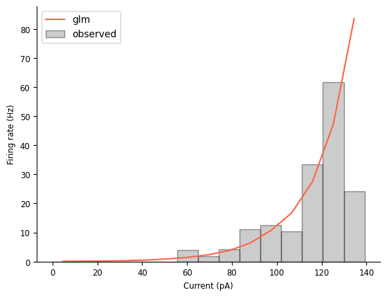
In addition to making that mismatch discussed earlier a little more obvious, this tuning curve comparison also highlights that this model thinks the firing rate will continue to grow as the injected current increases, which is not reflected in the data (or in our knowledge of how neurons work!).
Viewing this plot also makes it clear that the model’s tuning curve is approximately exponential. We already knew that! That’s what it means to be a LNP model of a single input. But it’s nice to see it made explicit.
Extending the model to use injection history#
We can try extending the model in order to improve its performance. There are many ways one can do this: the iterative refinement and improvement of your model is an important part of the scientific process! In this tutorial, we’ll discuss one such extension, but you’re encouraged to try others.
Our model right now assumes that the neuron’s spiking behavior is only driven by the instantaneous input current. That is, we’re saying that history doesn’t matter. But we know that neurons integrate information over time, so why don’t we add extend our model to reflect that?
To do so, we will change our predictors, including variables that represent the history of the input current as additional columns. First, we must decide the duration of time that we think is relevant: does current passed to the cell 10 msec ago matter? what about 100 msec? 1 sec? To start, we should use our a priori knowledge about the system to determine a reasonable initial value. In later notebooks, we’ll learn how to use NeMoS with scikit-learn to do formal model comparison in order to determine how much history is necessary.
For now, let’s use a duration of 200 msec:
current_history_duration_sec = .2
# convert this from sec to bins
current_history_duration = int(current_history_duration_sec / bin_size)
To construct our new predictors, we could simply take the current and shift it
incrementally. The value of predictor binned_current at time \(t\) is the injected
current at time \(t\); by shifting binned_current backwards by 1, we are modeling the
effect of the current at time \(t-1\) on the firing rate at time \(t\), and so on for all
shifts \(i\) up to current_history_duration:
binned_current[1:]
binned_current[2:]
# etc
Time (s)
----------  --
460.7705     0
460.7715     0
460.7725     0
460.7735     0
460.7745     0
460.7755     0
460.7765     0
...
488.7815     0
488.7825     0
488.7835     0
488.7845     0
488.7855     0
488.7865     0
488.7875     0
dtype: float64, shape: (28018,)
In general, however, this is not a good way to extend the model in the way discussed. You will end end up with a very large number of predictive variables (one for every bin shift!), which will make the model more sensitive to noise in the data.
A better idea is to do some dimensionality reduction on these predictors, by
parametrizing them using basis functions. These will allow us to capture
interesting non-linear effects with a relatively low-dimensional parametrization
that preserves convexity. NeMoS has a whole library of basis objects available
at nmo.basis, and choosing which set of basis functions and
their parameters, like choosing the duration of the current history predictor,
requires knowledge of your problem, but can later be examined using model
comparison tools.
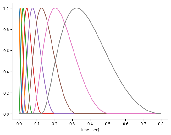
For history-type inputs like we’re discussing, the raised cosine log-stretched basis first described in Pillow et al., 2005 [1] is a good fit. This basis set has the nice property that their precision drops linearly with distance from event, which is a makes sense for many history-related inputs in neuroscience: whether an input happened 1 or 5 msec ago matters a lot, whereas whether an input happened 51 or 55 msec ago is less important.
doc_plots.plot_basis();
NeMoS’s Basis objects handle the construction and use of these basis functions. When
we instantiate this object, the main argument we need to specify is the number of
functions we want: with more basis functions, we’ll be able to represent the effect of
the corresponding input with the higher precision, at the cost of adding additional
parameters.
We also need to specify whether we want to use the convolutional (Conv) or
evaluation (Eval) form of the basis. This is determined by the type of feature
we wish to represent with the basis:
Evaluation bases transform the input through the non-linear function defined by the basis. This can be used to represent features such as spatial location and head direction.
Convolution bases apply a convolution of the input data to the bank of filters defined by the basis, and is particularly useful when analyzing data with inherent temporal dependencies, such as spike history or the history of input current in this example. In convolution mode, we must additionally specify the
window_size, the length of the filters in bins.
basis = nmo.basis.RaisedCosineLogConv(
    n_basis_funcs=8, window_size=current_history_duration,
)
Visualizing Basis objects
NeMoS provides some convenience functions for quickly visualizing the basis, in order to create plots like the type seen above.
# basis_kernels is an array of shape (current_history_duration, n_basis_funcs)
# while time is an array of shape (current_history_duration, )
time, basis_kernels = basis.evaluate_on_grid(current_history_duration)
# convert time to sec
time *= current_history_duration_sec
plt.plot(time, basis_kernels)
With this basis in hand, we can compress our input features:
# under the hood, this convolves the input with the filter bank visualized above
current_history = basis.compute_features(binned_current)
print(current_history)
Time (s)    0    1    2    3    4    ...
----------  ---  ---  ---  ---  ---  -----
460.7685    nan  nan  nan  nan  nan  ...
460.7695    nan  nan  nan  nan  nan  ...
460.7705    nan  nan  nan  nan  nan  ...
460.7715    nan  nan  nan  nan  nan  ...
460.7725    nan  nan  nan  nan  nan  ...
460.7735    nan  nan  nan  nan  nan  ...
460.7745    nan  nan  nan  nan  nan  ...
...         ...  ...  ...  ...  ...  ...
488.7815    0.0  0.0  0.0  0.0  0.0  ...
488.7825    0.0  0.0  0.0  0.0  0.0  ...
488.7835    0.0  0.0  0.0  0.0  0.0  ...
488.7845    0.0  0.0  0.0  0.0  0.0  ...
488.7855    0.0  0.0  0.0  0.0  0.0  ...
488.7865    0.0  0.0  0.0  0.0  0.0  ...
488.7875    0.0  0.0  0.0  0.0  0.0  ...
dtype: float32, shape: (28020, 8)
/home/agent/workspace/rorse_ccn-software-jan-2025_main/lib/python3.11/site-packages/pynapple/core/utils.py:196: UserWarning: Converting 'd' to numpy.array. The provided array was of type 'ArrayImpl'.
  warnings.warn(
/home/agent/workspace/rorse_ccn-software-jan-2025_main/lib/python3.11/site-packages/pynapple/core/time_series.py:300: DeprecationWarning: `newshape` keyword argument is deprecated, use `shape=...` or pass shape positionally instead. (deprecated in NumPy 2.1)
  out = func._implementation(*new_args, **kwargs)
We can see that our design matrix is now 28020 time points by 8 features, one for each of our basis functions. If we had used the raw shifted data as the features, like we started to do above, we’d have a design matrix with 200 features, so we’ve ended up with more than an order of magnitude fewer features!
Note that we have a bunch of NaNs at the beginning of each column. That’s because of boundary handling: we’re using the input of the past 200 msecs to predict the firing rate at time \(t\), so what do we do in the first 200 msecs? The safest way is to ignore them, so that the model doesn’t consider them during the fitting procedure.
What do these features look like?
# in this plot, we're normalizing the amplitudes to make the comparison easier --
# the amplitude of these features will be fit by the model, so their un-scaled
# amplitudes is not informative
workshop_utils.plot_current_history_features(binned_current, current_history, basis,
                                             current_history_duration_sec)
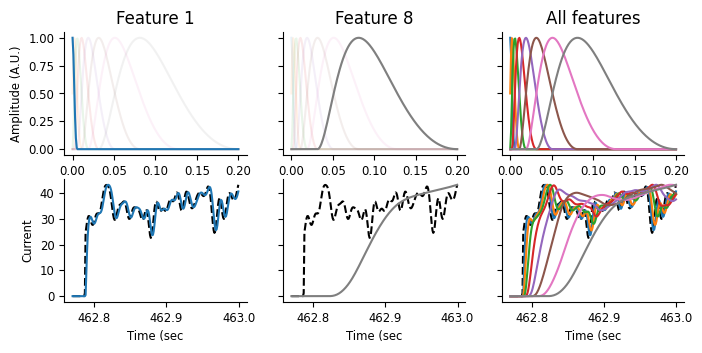
On the top row, we’re visualizing the basis functions, as above. On the bottom row, we’re showing the input current, as a black dashed line, and corresponding features over a small window of time, just as the current is being turned on. These features are the result of a convolution between the basis function on the top row with the black dashed line shown below. As the basis functions get progressively wider and delayed from the event start, we can thus think of the features as weighted averages that get progressively later and smoother. Let’s step through that a bit more slowly.
In the leftmost plot, we can see that the first feature almost perfectly tracks the input. Looking at the basis function above, that makes sense: this function’s max is at 0 and quickly decays. This feature is thus a very slightly smoothed version of the instantaneous current feature we were using before. In the middle plot, we can see that the last feature has a fairly long lag compared to the current, and is a good deal smoother. Looking at the rightmost plot, we can see that the other features vary between these two extremes, getting smoother and more delayed.
These are the elements of our feature matrix: representations of not just the instantaneous current, but also the current history, with precision decreasing as the lag between the predictor and current increases. Let’s see what this looks like when we go to fit the model!
We’ll initialize and create the GLM object in the same way as before, only changing the design matrix we pass to the model:
history_model = nmo.glm.GLM(solver_name="LBFGS")
history_model.fit(current_history, count)
GLM(
    observation_model=PoissonObservations(inverse_link_function=exp),
    regularizer=UnRegularized(),
    solver_name='LBFGS'
)
As before, we can examine our parameters, coef_ and intercept_:
print(f"firing_rate(t) = exp({history_model.coef_} * current(t) + {history_model.intercept_})")
firing_rate(t) = exp([ 0.01429164  0.00207243  0.00042043  0.00646257 -0.00618818  0.00152725
  0.00034394 -0.00041221] * current(t) + [-9.632734])
Notice the shape of these parameters:
print(history_model.coef_.shape)
print(history_model.intercept_.shape)
(8,)
(1,)
coef_ has 8 values now, while intercept_ still has one — why is that?
Because we now have 8 features, but still only 1 neuron whose firing rate we’re
predicting.
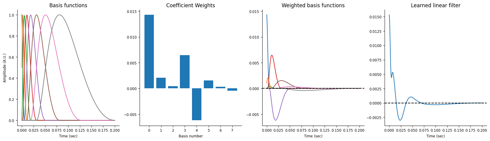
In addition to visualizing the model’s predictions (which we’ll do in a second), we can also examine the model’s learned filter. Our earlier model was just learning a simple function linking the input current and the firing rate, but this model learns a filter, which gets convolved with the input before having the intercept added and being exponentiated to give us the predicted firing rate.
Visualize the current history model’s learned filter.
This filter is convolved with the input current and used to predict the firing rate.
workshop_utils.plot_basis_filter(basis, history_model)
Let’s re-examine our predicted firing rate and see how the new model does:
compare the predicted firing rate to the data and the old model
what do we see?
# all this code is the same as above
history_pred_fr = history_model.predict(current_history)
history_pred_fr = history_pred_fr / bin_size
smooth_history_pred_fr = history_pred_fr.dropna().smooth(.05, size_factor=20)
workshop_utils.current_injection_plot(current, spikes, firing_rate,
                                      # compare against the old firing rate
                                      smooth_history_pred_fr, smooth_predicted_fr)
/home/agent/workspace/rorse_ccn-software-jan-2025_main/lib/python3.11/site-packages/pynapple/core/utils.py:196: UserWarning: Converting 'd' to numpy.array. The provided array was of type 'ArrayImpl'.
  warnings.warn(
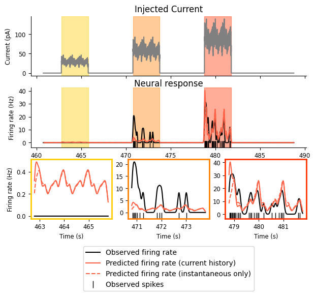
We can see that there are only some small changes here. Our new model maintains the two successes of the old one: firing rate increases with injected current and shows the observed periodicity. Our model has not improved the match between the firing rate in the first or second intervals, but it seems to do a better job of capturing the onset transience, especially in the third interval.
We can similarly examine our mean firing rate:
# compare observed mean firing rate with the history_model predicted one
print(f"Observed mean firing rate: {np.mean(count) / bin_size} Hz")
print(f"Predicted mean firing rate (instantaneous current): {np.nanmean(predicted_fr)} Hz")
print(f"Predicted mean firing rate (current history): {np.nanmean(smooth_history_pred_fr)} Hz")
Observed mean firing rate: 1.4275517487508922 Hz
Predicted mean firing rate (instantaneous current): 1.4306069612503052 Hz
Predicted mean firing rate (current history): 1.4746827445286446 Hz
And our tuning curves:
# Visualize tuning curve
tuning_curve_history_model = nap.compute_1d_tuning_curves_continuous(smooth_history_pred_fr, current, 15)
fig = doc_plots.tuning_curve_plot(tuning_curve)
fig.axes[0].plot(tuning_curve_history_model, color="tomato", label="glm (current history)")
fig.axes[0].plot(tuning_curve_model, color="tomato", linestyle='--', label="glm (instantaneous current)")
fig.axes[0].legend()
<matplotlib.legend.Legend at 0x7fd30c494d90>
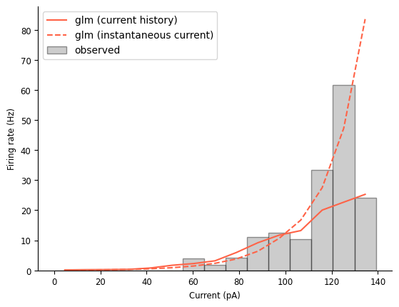
This new model is doing a comparable job matching the mean firing rate. Looking at the tuning curve, it looks like this model does a better job at a lot of firing rate levels, but its maximum firing rate is far too low and it’s not clear if the tuning curve has leveled off.
Comparing the two models by examining their predictions is important, but you may also
want a number with which to evaluate and compare your models’ performance. As
discussed earlier, the GLM optimizes log-likelihood to find the best-fitting
weights, and we can calculate this number using its score method:
log_likelihood = model.score(predictor, count, score_type="log-likelihood")
print(f"log-likelihood (instantaneous current): {log_likelihood}")
log_likelihood = history_model.score(current_history, count, score_type="log-likelihood")
print(f"log-likelihood (current history): {log_likelihood}")
log-likelihood (instantaneous current): -0.007939910516142845
log-likelihood (current history): -0.007518902886658907
This log-likelihood is un-normalized and thus doesn’t mean that much by itself, other than “higher=better”. When comparing alternative GLMs fit on the same dataset, whether that’s models using different regularizers and solvers or those using different predictors, comparing log-likelihoods is a reasonable thing to do.
Note
Under the hood, NeMoS is minimizing the negative log-likelihood, as is
typical in many optimization contexts. score returns the real
log-likelihood, however, and thus higher is better.
Thus, we can see that, judging by the log-likelihood, the addition of the
current history to the model makes the model slightly better. We have also
increased the number of parameters, which can make you more susceptible to
overfitting and so, while the difference is small here, it’s possible that
including the extra parameters has made us more sensitive to noise. To properly
investigate whether that’s the case, one should split the dataset into test and
train sets, training the model on one subset of the data and testing it on
another to test the model’s generalizability. We’ll see a simple version of this
in the next notebook, and a more streamlined version,
using scikit-learn’s pipelining and cross-validation machinery, will be shown
in the final notebook.
Finishing up#
Note that, because the log-likelihood is un-normalized, it should not be compared across datasets (because e.g., it won’t account for difference in noise levels). We provide the ability to compute the pseudo-\(R^2\) for this purpose:
r2 = model.score(predictor, count, score_type='pseudo-r2-Cohen')
print(f"pseudo-r2 (instantaneous current): {r2}")
r2 = history_model.score(current_history, count, score_type='pseudo-r2-Cohen')
print(f"pseudo-r2 (current history): {r2}")
pseudo-r2 (instantaneous current): 0.30376726388931274
pseudo-r2 (current history): 0.3538113534450531
Further Exercises#
Despite the simplicity of this dataset, there is still more that we can do here. The following sections provide some possible exercises to try yourself!
Other stimulation protocols
We’ve only fit the model to a single stimulation protocol, but our dataset contains many more! How does the model perform on “Ramp”? On “Noise 2”? Based on the example code above, write new code that fits the model on some other stimulation protocol and evaluate its performance. Which stimulation does it perform best on? Which is the worst?
Train and test sets
In this example, we’ve used been fitting and evaluating our model on the same data set. That’s generally a bad idea! Try splitting the data in to train and test sets, fitting the model to one portion of the data and evaluating on another portion. You could split this stimulation protocol into train and test sets or use different protocols to train and test on.
Model extensions
Our model did not do a good job capturing the onset transience seen in the data, and we could probably improve the match between the amplitudes of the predicted firing rate and smoothed spike train. How would we do that?
We could try adding the following inputs to the model, alone or together:
Tinkering with the current history: we tried adding the current history to the model, but we only investigated one set of choices with the basis functions. What if we tried changing the duration of time we considered (
current_history_duration_sec)? Different numbers of basis functions? A different choice for theBasisobject altogether? What effects would these have on our model?Spiking history: we know neurons have a refactory period (they are unable to spike a second time immediately after spiking), so maybe making the model aware of whether the neuron spiked recently could help better capture the onset transience.
More complicated tuning curve: as we saw with the tuning curve plots, neither model explored here quite accurately captures the relationship between the current and the firing rate. Can we improve that somehow? We saw that adding the current history changed this relationship, but we can also change it without including the history by using an
Evalbasis object. We’ll see how to do this in more detail in the final notebook
Data citation#
The data used in this tutorial is from the Allen Brain Map, with the following citation:
Contributors: Agata Budzillo, Bosiljka Tasic, Brian R. Lee, Fahimeh Baftizadeh, Gabe Murphy, Hongkui Zeng, Jim Berg, Nathan Gouwens, Rachel Dalley, Staci A. Sorensen, Tim Jarsky, Uygar Sümbül Zizhen Yao
Dataset: Allen Institute for Brain Science (2020). Allen Cell Types Database – Mouse Patch-seq [dataset]. Available from brain-map.org/explore/classes/multimodal-characterization.
Primary publication: Gouwens, N.W., Sorensen, S.A., et al. (2020). Integrated morphoelectric and transcriptomic classification of cortical GABAergic cells. Cell, 183(4), 935-953.E19. https://doi.org/10.1016/j.cell.2020.09.057
Patch-seq protocol: Lee, B. R., Budzillo, A., et al. (2021). Scaled, high fidelity electrophysiological, morphological, and transcriptomic cell characterization. eLife, 2021;10:e65482. https://doi.org/10.7554/eLife.65482
Mouse VISp L2/3 glutamatergic neurons: Berg, J., Sorensen, S. A., Miller, J., Ting, J., et al. (2021) Human neocortical expansion involves glutamatergic neuron diversification. Nature, 598(7879):151-158. doi: 10.1038/s41586-021-03813-8