%matplotlib inline
Data analysis with pynapple#
Learning objectives#
Loading a NWB file
Compute tuning curves
Decode neural activity
Compute correlograms
Compute perievent
The pynapple documentation can be found here.
The API documentation is here.
Let’s start by importing the pynapple package, matplotlib, numpy to see if everything is correctly installed.
If an import fails, you can do !pip install pynapple matplotlib in a cell to fix it.
import pynapple as nap
import matplotlib.pyplot as plt
import workshop_utils
import numpy as np
WARNING:2025-02-04 19:31:35,898:jax._src.xla_bridge:987: An NVIDIA GPU may be present on this machine, but a CUDA-enabled jaxlib is not installed. Falling back to cpu.
/home/agent/workspace/rorse_ccn-software-jan-2025_main/lib/python3.11/site-packages/nemos/_documentation_utils/plotting.py:38: UserWarning: plotting functions contained within `_documentation_utils` are intended for nemos's documentation. Feel free to use them, but they will probably not work as intended with other datasets / in other contexts.
  warnings.warn(
Loading a NWB file#
Pynapple commit to support NWB for data loading. If you have installed the repository, you can run the following cell:
path = workshop_utils.fetch_data("Mouse32-140822.nwb")

print(path)
/home/agent/workspace/rorse_ccn-software-jan-2025_main/lib/python3.11/data/Mouse32-140822.nwb
Pynapple provides the convenience function nap.load_file for loading a NWB file.
Question: Can you open the NWB file giving the variable path to the function load_file and call the output data?
data = nap.load_file(path)

print(data)
/home/agent/workspace/rorse_ccn-software-jan-2025_main/lib/python3.11/site-packages/hdmf/spec/namespace.py:535: UserWarning: Ignoring cached namespace 'hdmf-common' version 1.5.0 because version 1.8.0 is already loaded.
  warn("Ignoring cached namespace '%s' version %s because version %s is already loaded."
/home/agent/workspace/rorse_ccn-software-jan-2025_main/lib/python3.11/site-packages/hdmf/spec/namespace.py:535: UserWarning: Ignoring cached namespace 'core' version 2.4.0 because version 2.7.0 is already loaded.
  warn("Ignoring cached namespace '%s' version %s because version %s is already loaded."
/home/agent/workspace/rorse_ccn-software-jan-2025_main/lib/python3.11/site-packages/hdmf/spec/namespace.py:535: UserWarning: Ignoring cached namespace 'hdmf-experimental' version 0.1.0 because version 0.5.0 is already loaded.
  warn("Ignoring cached namespace '%s' version %s because version %s is already loaded."
Mouse32-140822
┍━━━━━━━━━━━━━━━━━━━━━━━┯━━━━━━━━━━━━━┑
│ Keys                  │ Type        │
┝━━━━━━━━━━━━━━━━━━━━━━━┿━━━━━━━━━━━━━┥
│ units                 │ TsGroup     │
│ sws                   │ IntervalSet │
│ rem                   │ IntervalSet │
│ position_time_support │ IntervalSet │
│ epochs                │ IntervalSet │
│ ry                    │ Tsd         │
┕━━━━━━━━━━━━━━━━━━━━━━━┷━━━━━━━━━━━━━┙
The content of the NWB file is not loaded yet. The object data behaves like a dictionnary.
Question: Can you load the spike times from the NWB and call the variables spikes?
spikes = data["units"] # Get spike timings
Question: And print it?
print(spikes)
Index    rate     location    group
-------  -------  ----------  -------
0        2.96981  thalamus    1
1        2.42638  thalamus    1
2        5.93417  thalamus    1
3        5.04432  thalamus    1
4        0.30207  adn         2
5        0.87042  adn         2
6        0.36154  adn         2
...      ...      ...         ...
42       1.02061  thalamus    5
43       6.84913  thalamus    6
44       0.94002  thalamus    6
45       0.55768  thalamus    6
46       1.15056  thalamus    6
47       0.46084  thalamus    6
48       0.19287  thalamus    7
There are a lot of neurons. The neurons that interest us are the neurons labeled adn.
Question: Using the slicing method of your choice, can you select only the neurons in adn that are above 1 Hz firing rate?
spikes = spikes[(spikes.location=='adn') & (spikes.rate>1.0)]

print(spikes)
Index    rate      location    group
-------  --------  ----------  -------
7        10.51737  adn         2
8        2.62475   adn         2
9        2.55818   adn         2
10       7.06715   adn         2
12       1.58248   adn         2
13       4.87837   adn         2
14       8.47337   adn         2
...      ...       ...         ...
26       4.0242    adn         3
28       1.78011   adn         4
29       4.23006   adn         4
30       2.15215   adn         4
32       1.12899   adn         4
33       5.26316   adn         4
34       1.57122   adn         4
The NWB file contains other informations about the recording. ry contains the value of the head-direction of the animal over time.
Question: Can you extract the angle of the animal in a variable called angle and print it?
angle = data["ry"]
print(angle)
Time (s)
----------  --------
8812.416    0.581795
8812.4416   0.578113
8812.4672   0.571791
8812.4928   0.554532
8812.5184   0.554532
8812.544    0.554532
8812.5696   0.554532
...
10771.123   5.67668
10771.149   5.67668
10771.174   5.7182
10771.2     5.74727
10771.226   5.74727
10771.251   5.74727
10771.277   5.72318
dtype: float64, shape: (71478,)
But are the data actually loaded … or not?
Question: Can you print the underlying data array of angle?
print(angle.d)
<HDF5 dataset "data": shape (71478,), type "<f8">
The animal was recorded during wakefulness and sleep.
Question: Can you extract the behavioral intervals in a variable called epochs?
epochs = data["epochs"]

print(epochs)
  index    start      end  tags
      0      0     8812.3  ['sleep']
      1   8812.3  10771.3  ['wake']
      2  10771.3  22025    ['sleep']
shape: (3, 2), time unit: sec.
/home/agent/workspace/rorse_ccn-software-jan-2025_main/lib/python3.11/site-packages/pynapple/io/interface_nwb.py:90: UserWarning: DataFrame is not sorted by start times. Sorting it.
  data = nap.IntervalSet(df)
NWB file can save intervals with multiple labels. The object IntervalSet includes the labels as a metadata object.
Question: Using the column tags, can you create one IntervalSet object for intervals labeled wake and one IntervalSet object for intervals labeled sleep?
wake_ep = epochs[epochs.tags=="wake"]
sleep_ep = epochs[epochs.tags=="sleep"]
Compute tuning curves#
Now that we have spikes and a behavioral feature (i.e. head-direction), we would like to compute the firing rate of neurons as a function of the variable angle during wake_ep.
To do this in pynapple, all you need is a single line of code!
Question: can you compute the firing rate of ADn units as a function of heading direction, i.e. a head-direction tuning curve and call the variable tuning_curves?
tuning_curves = nap.compute_1d_tuning_curves(
    group=spikes,
    feature=angle,
    nb_bins=61,
    ep = angle.time_support,
    minmax=(0, 2 * np.pi)
    )
Question: Can you plot some tuning curves?
plt.figure()
plt.subplot(221)
plt.plot(tuning_curves.iloc[:,0])
plt.subplot(222,projection='polar')
plt.plot(tuning_curves.iloc[:,0])
plt.subplot(223)
plt.plot(tuning_curves.iloc[:,1])
plt.subplot(224,projection='polar')
plt.plot(tuning_curves.iloc[:,1])
[<matplotlib.lines.Line2D at 0x7f815c50d5d0>]
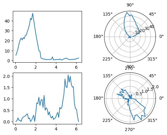
Most of those neurons are head-directions neurons.
The next cell allows us to get a quick estimate of the neurons’s preferred direction.
pref_ang = tuning_curves.idxmax()
Question: Can you add it to the metainformation of spikes?
spikes['pref_ang'] = pref_ang
This index maps a neuron to a preferred direction between 0 and 360 degrees.
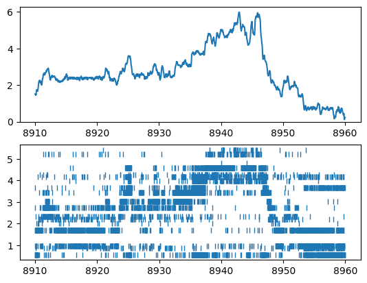
Question: Can you plot the spiking activity of the neurons based on their preferred direction as well as the head-direction of the animal?
For the sake of visibility, you should restrict the data to the following epoch : ex_ep = nap.IntervalSet(start=8910, end=8960).
ex_ep = nap.IntervalSet(start=8910, end=8960)


plt.figure()
plt.subplot(211)
plt.plot(angle.restrict(ex_ep))
plt.ylim(0, 2*np.pi)

plt.subplot(212)
plt.plot(spikes.restrict(ex_ep).to_tsd("pref_ang"), '|')
[<matplotlib.lines.Line2D at 0x7f815c5cee10>]
Decode neural activity#
Population activity clearly codes for head-direction. Can we use the spiking activity of the neurons to infer the current heading of the animal? The process is called bayesian decoding.
Question: Using the right pynapple function, can you compute the decoded angle from the spiking activity during wakefulness?
decoded, proba_feature = nap.decode_1d(
    tuning_curves=tuning_curves,
    group=spikes,
    ep=wake_ep,
    bin_size=0.3,  # second
)
Question: … and display the decoded angle next to the true angle?
plt.figure()
plt.subplot(211)
plt.plot(angle.restrict(ex_ep))
plt.plot(decoded.restrict(ex_ep), label="decoded")
plt.ylim(0, 2*np.pi)

plt.subplot(212)
plt.plot(spikes.restrict(ex_ep).to_tsd("pref_ang"), '|')
[<matplotlib.lines.Line2D at 0x7f815c381e90>]
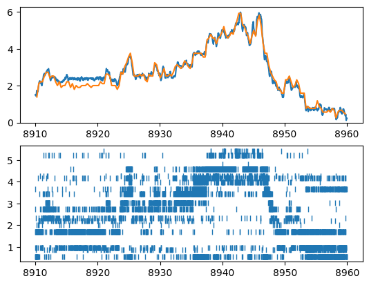
Since the tuning curves were computed during wakefulness, it is a circular action to decode spiking activity during wakefulness. We can try something more interesting by trying to decode the angle during sleep.
Question: Can you instantiate an IntervalSet object called rem_ep that contains the epochs of REM sleep? You can check the contents of the NWB file by doing first print(data)
rem_ep = data['rem'][1]
Question: Can you compute the decoded angle from the spiking activity during REM sleep?
decoded, proba_feature = nap.decode_1d(
    tuning_curves=tuning_curves,
    group=spikes,
    ep=rem_ep,
    bin_size=0.3,  # second
)
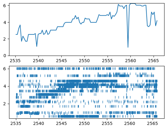
Question: … and display the decoded angle next to the spiking activity?
plt.figure()
plt.subplot(211)
plt.plot(decoded.restrict(rem_ep), label="decoded")
plt.ylim(0, 2*np.pi)

plt.subplot(212)
plt.plot(spikes.restrict(rem_ep).to_tsd("pref_ang"), '|')
[<matplotlib.lines.Line2D at 0x7f815c371350>]
Compute correlograms#
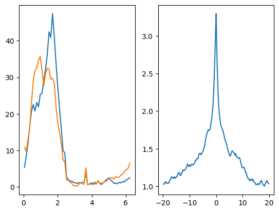
We see that some neurons have a correlated activity. Can we measure it?
Question: Can you compute cross-correlograms during wake for all pairs of neurons and call it cc_wake?
cc_wake = nap.compute_crosscorrelogram(spikes, binsize=0.2, windowsize=20.0, ep=wake_ep)
Question: can you plot the cross-correlogram during wake of 2 neurons firing for the same direction?
index = spikes.keys()


plt.figure()
plt.subplot(121)
plt.plot(tuning_curves[7])
plt.plot(tuning_curves[20])
plt.subplot(122)
plt.plot(cc_wake[(7, 20)])
[<matplotlib.lines.Line2D at 0x7f815442f650>]
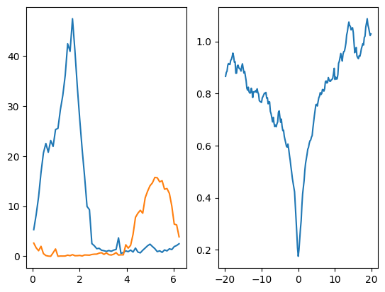
Question: can you plot the cross-correlogram during wake of 2 neurons firing for opposite directions?
index = spikes.keys()


plt.figure()
plt.subplot(121)
plt.plot(tuning_curves[7])
plt.plot(tuning_curves[26])
plt.subplot(122)
plt.plot(cc_wake[(7, 26)])
[<matplotlib.lines.Line2D at 0x7f81544cbe90>]
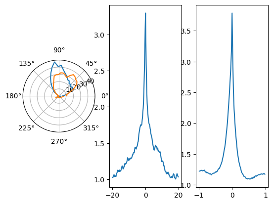
Pairwise correlation were computed during wakefulness. The activity of the neurons was also recorded during sleep.
Question: can you compute the cross-correlograms during sleep?
cc_sleep = nap.compute_crosscorrelogram(spikes, 0.02, 1.0, ep=sleep_ep)
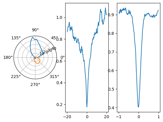
Question: can you display the cross-correlogram for wakefulness and sleep of the same pairs of neurons?
plt.figure()
plt.subplot(131, projection='polar')
plt.plot(tuning_curves[7])
plt.plot(tuning_curves[20])
plt.subplot(132)
plt.plot(cc_wake[(7, 20)])
plt.subplot(133)
plt.plot(cc_sleep[(7, 20)])
[<matplotlib.lines.Line2D at 0x7f81543ce190>]
plt.figure()
plt.subplot(131, projection='polar')
plt.plot(tuning_curves[7])
plt.plot(tuning_curves[26])
plt.subplot(132)
plt.plot(cc_wake[(7, 26)])
plt.subplot(133)
plt.plot(cc_sleep[(7, 26)])
[<matplotlib.lines.Line2D at 0x7f81542d1850>]
Compute perievent#
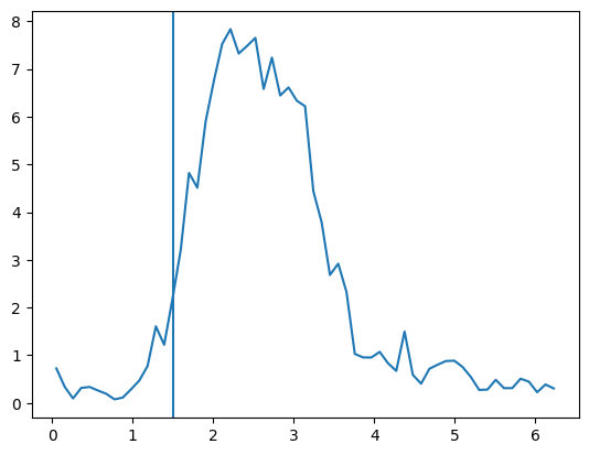
Sometimes, some events occurs during recording such as rewards. There was no particular events during this recording but we can look for when the head-direction is close to a particular direction as an event.
plt.figure()
plt.plot(tuning_curves[9])
plt.axvline(1.5)

crossing_times = np.cos(angle).threshold(np.cos(1.5), "below").time_support.start
crossing_times = nap.Ts(t=crossing_times)
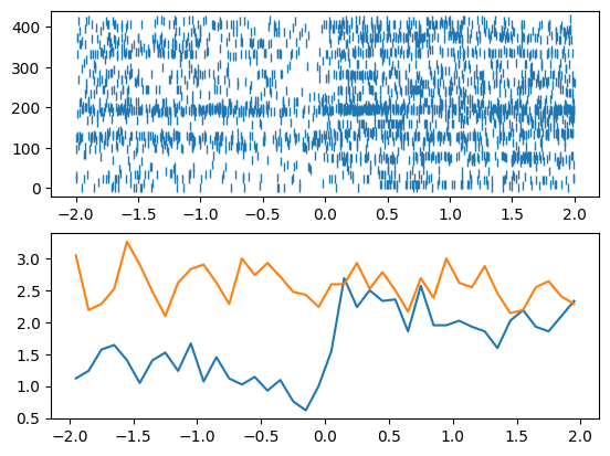
Question: Can you compute a perievent time histogram around the timestamps defined in crossing_times for neuron 9?
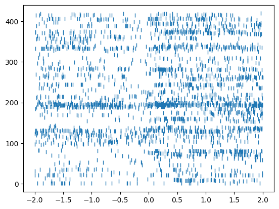
peth = nap.compute_perievent(spikes[9], crossing_times, minmax=(-2, 2))
Question: …and plot the spikes?
plt.figure()
plt.plot(peth.to_tsd(), '|')
[<matplotlib.lines.Line2D at 0x7f815c507d50>]
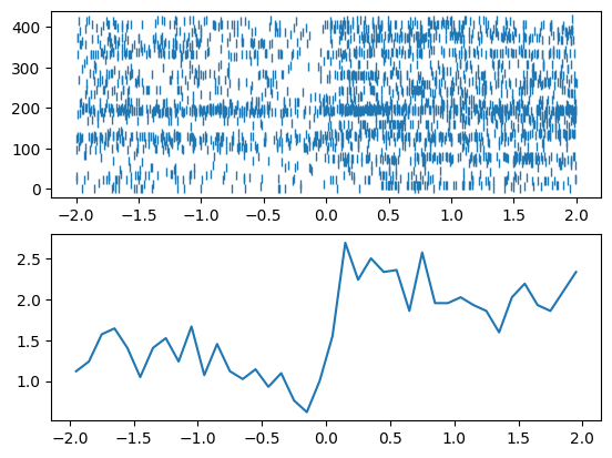
Question: Can you compute the mean firing rate of the PETH around crossing_times in bins of 100 ms?
mean_fr = np.mean(peth.count(0.1)/0.1, 1)
Question: … and plot it?
plt.figure()
plt.subplot(211)
plt.plot(peth.to_tsd(), '|')
plt.subplot(212)
plt.plot(mean_fr)
[<matplotlib.lines.Line2D at 0x7f815c2dccd0>]
Is this a strong effect? We would like to compare this to surrogate dataset.
Question: Shuffling the spike trains, can you generate a mean random PETH to compare to the true mean PETH?
rand_ts = nap.shuffle_ts_intervals(spikes[9])
rand_peth = nap.compute_perievent(rand_ts, crossing_times, minmax=(-2, 2))

plt.figure()
plt.subplot(211)
plt.plot(peth.to_tsd(), '|')
plt.subplot(212)
plt.plot(mean_fr)
plt.plot(np.mean(rand_peth.count(0.1)/0.1, 1))
[<matplotlib.lines.Line2D at 0x7f81784ee750>]
