Signal processing and decoding in pynapple#
Identifying phase precession and hippocampal sequences#
In this tutorial we will learn how to use more advanced applications of pynapple: signal processing and decoding. We’ll apply these methods to demonstrate and visualize some well-known physiological properties of hippocampal activity, specifically phase presession of place cells and sequential coordination of place cell activity during theta oscillations.
Objectives#
We can break our goals of identifying phase presession and coordinated activity of place cells into the following objectives:
Get a feel for the data set
Load in and visualize the data
Restrict the data to regions of interest
Identify and extract theta oscillations in the LFP
Decompose the LFP into frequency components to identify theta oscillations
Filter the LFP to isolate the theta frequency band
Identify place cells
Calculate 1D tuning curves to identify place selectivity across many units
Visualize phase precession
Compare spike location to spike phase in a single unit
Calculate 2D tuning curves to identify place vs phase selectivity across many units
Reconstruct spatial sequences from population activity
Apply Bayesian decoding to predict position from spiking activity
Decode at a fast time-scale to identify spatial “sweeps” coordinated with theta oscillations
# suppress warnings
import warnings
warnings.simplefilter("ignore")

# imports
import math
import os
import matplotlib.pyplot as plt
import numpy as np
import pandas as pd
import requests
from scipy import signal
import seaborn as sns
import tqdm
import pynapple as nap
import workshop_utils

# necessary for animation
import nemos as nmo
plt.style.use(nmo.styles.plot_style)
WARNING:2025-02-04 19:31:56,129:jax._src.xla_bridge:987: An NVIDIA GPU may be present on this machine, but a CUDA-enabled jaxlib is not installed. Falling back to cpu.
Fetching the data#
The data set we’ll be looking at is from the manuscript Diversity in neural firing dynamics supports both rigid and learned hippocampal sequences. In this study, the authors collected electrophisiology data in rats across multiple sites in layer CA1 of hippocampus to extract the LFP alongside spiking activity of many simultaneous pyramidal units. In each recording session, data were collected while the rats explored a novel environment (a linear or circular track), as well as during sleep before and after exploration. In our following analyses, we’ll focus on the exploration period of a single rat and recording session.
The full dataset for this study can be accessed on DANDI. Since the file size of a recording session can be large from the LFP saved for each recorded channel, we’ll use a smaller file that contains the spiking activity and the LFP from a single, representative channel, which is hosted on OSF. This smaller file, like the original data, is saved as an NWB file.
If you ran the workshop setup script, you should have this file downloaded already. If not, the function we’ll use to fetch it will download it for you. This function is called fetch_data, and can be imported from the workshop_utils module.
Manuscript: Diversity in neural firing dynamics supports both rigid and learned hippocampal sequences
Full data source: DANDI
# fetch file path
path = workshop_utils.fetch_data("Achilles_10252013_EEG.nwb")
Downloading file 'Achilles_10252013_EEG.nwb' from 'https://osf.io/2dfvp/download' to '/home/agent/workspace/rorse_ccn-software-jan-2025_main/lib/python3.11/data'.
This function will give us the file path to where the data is stored. We can then use the pynapple function load_file to load in the data, which is able to handle the NWB file type.
# load data with pynapple
data = nap.load_file(path)
print(data)
Achilles_10252013_EEG
┍━━━━━━━━━━━━━┯━━━━━━━━━━━━━┑
│ Keys        │ Type        │
┝━━━━━━━━━━━━━┿━━━━━━━━━━━━━┥
│ units       │ TsGroup     │
│ rem         │ IntervalSet │
│ nrem        │ IntervalSet │
│ forward_ep  │ IntervalSet │
│ eeg         │ TsdFrame    │
│ theta_phase │ Tsd         │
│ position    │ Tsd         │
┕━━━━━━━━━━━━━┷━━━━━━━━━━━━━┙
This returns a dictionary of pynapple objects that have been extracted from the NWB file. Let’s explore each of these objects.
Note
We will ignore the object theta_phase because we will be computing this ourselves later on in the exercise.
units#
The units field is a TsGroup: a collection of Ts objects containing the spike times of each unit, where the “Index” is the unit number or key. Each unit has the following metadata:
rate: computed by pynapple, is the average firing rate of the neuron across all recorded time points.
location, shank, and cell_type: variables saved and imported from the original data set.
data["units"]
Index    rate     location    shank    cell_type
-------  -------  ----------  -------  -----------
1        1.56775  ca1         1        pE
2        9.12029  ca1         1        pI
6        0.14618  ca1         1        pE
7        1.40307  ca1         1        pE
9        0.22848  ca1         1        pE
11       0.4157   ca1         1        pE
12       1.57063  ca1         1        pE
...      ...      ...         ...      ...
266      0.6839   ca1         13       pE
267      3.0145   ca1         13       pI
268      0.86567  ca1         13       pE
269      0.28607  ca1         13       pE
270      0.30931  ca1         13       pE
271      0.35912  ca1         13       pE
272      0.62102  ca1         13       pE
We can access the spike times of a single unit by indexing the TsGroup by its unit number. For example, to access the spike times of unit 1:
data["units"][1]
Time (s)
12683.7723
12688.18085
12691.3421
12691.62475
12691.77515
12695.471
12700.2699
...
25536.359
25539.8976
25539.9318
25545.21125
25545.21885
25545.22585
25545.2324
shape: 20173
rem, nrem, and forward_ep#
The next three objects; rem, nrem, and forward_ep; are all IntervalSets containing time windows of REM sleep, nREM sleep, and forward runs down the linear maze, respectively.
data["rem"]
  index    start    end
      0    13747  13934
      1    15963  15991
      2    16035  16214
      3    22521  22573
shape: (4, 2), time unit: sec.
data["nrem"]
  index    start    end
      0    12892  13746
      1    13971  15963
      2    15991  16034
      3    16241  16565
      4    16837  16874
      5    17059  18076
      6    21350  21399
      7    22068  22520
      8    22635  22745
      9    24326  24419
     10    24953  25547
shape: (11, 2), time unit: sec.
data["forward_ep"]
index    start            end
0        18193.598802655  18197.489989104
1        18198.437185805  18201.30437582
2        18240.625838885  18243.083430326
3        18273.95692281   18276.414514252
4        18315.940776603  18318.244768579
5        18347.377467126  18347.761465788
6        18350.193457319  18350.500656249
...      ...              ...
77       18193.598802655  18197.489989104
78       18198.437185805  18201.30437582
79       18240.625838885  18243.083430326
80       18273.95692281   18276.414514252
81       18315.940776603  18318.244768579
82       18347.377467126  18347.761465788
83       18350.193457319  18350.500656249
shape: (84, 2), time unit: sec.
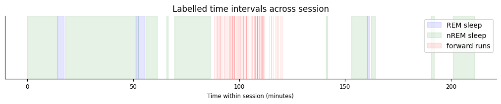
All intervals in forward_ep occur in the middle of the session, while rem and nrem both contain sleep epochs that occur before and after exploration.
The following plot demonstrates how each of these labelled epochs are organized across the session.
t_start = data["nrem"].start[0]
fig,ax = plt.subplots(figsize=(10,2), constrained_layout=True)
sp1 = [ax.axvspan((iset.start[0]-t_start)/60, (iset.end[0]-t_start)/60, color="blue", alpha=0.1) for iset in data["rem"]];
sp2 = [ax.axvspan((iset.start[0]-t_start)/60, (iset.end[0]-t_start)/60, color="green", alpha=0.1) for iset in data["nrem"]];
sp3 = [ax.axvspan((iset.start[0]-t_start)/60, (iset.end[0]-t_start)/60, color="red", alpha=0.1) for iset in data["forward_ep"]];
ax.set(xlabel="Time within session (minutes)", title="Labelled time intervals across session", yticks=[])
ax.legend([sp1[0],sp2[0],sp3[0]], ["REM sleep","nREM sleep","forward runs"]);
eeg#
The eeg object is a TsdFrame containing an LFP voltage trace for a single representative channel in CA1.
data["eeg"]
Time (s)    1
----------  ----
12679.5     -258
12679.5008  -341
12679.5016  -355
12679.5024  -379
12679.5032  -364
12679.504   -406
12679.5048  -508
...         ...
25546.9696  2035
25546.9704  2021
25546.9712  2023
25546.972   1906
25546.9728  1848
25546.9736  1862
25546.9744  1976
dtype: int16, shape: (16084344, 1)
Despite having a single column, this TsdFrame is still a 2D object. We can represent this as a 1D Tsd by indexing into the first column.
data["eeg"][:,0]
Time (s)
----------  ----
12679.5     -258
12679.5008  -341
12679.5016  -355
12679.5024  -379
12679.5032  -364
12679.504   -406
12679.5048  -508
...
25546.9696  2035
25546.9704  2021
25546.9712  2023
25546.972   1906
25546.9728  1848
25546.9736  1862
25546.9744  1976
dtype: int16, shape: (16084344,)
position#
The final object, position, is a Tsd containing the linearized position of the animal, in centimeters, recorded during the exploration window.
data["position"]
Time (s)
---------------  ---
18079.5          nan
18079.525599911  nan
18079.551199822  nan
18079.576799733  nan
18079.602399643  nan
18079.627999554  nan
18079.653599465  nan
...
20146.820800624  nan
20146.846400535  nan
20146.872000446  nan
20146.897600357  nan
20146.923200267  nan
20146.948800178  nan
20146.974400089  nan
dtype: float64, shape: (80762,)
Positions that are not defined, i.e. when the animal is at rest, are filled with NaN.
This object additionally contains a time_support attribute, which gives the time interval during which positions are recorded (including points recorded as NaN).
data["position"].time_support
  index    start    end
      0  18079.5  20147
shape: (1, 2), time unit: sec.
Let’s visualize the first 300 seconds of position data and overlay forward_ep intervals.
pos_start = data["position"].time_support.start[0]
fig, ax = plt.subplots(figsize=(10,3))
l1 = ax.plot(data["position"])
l2 = [ax.axvspan(iset.start[0], iset.end[0], color="red", alpha=0.1) for iset in data["forward_ep"]];
ax.set(xlim=[pos_start,pos_start+300], ylabel="Position (cm)", xlabel="Time (s)", title="Tracked position along linear maze")
ax.legend([l1[0], l2[0]], ["animal position", "forward run epochs"])
<matplotlib.legend.Legend at 0x7f24781e9390>
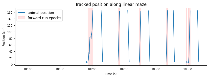
This plot confirms that positions are only recorded while the animal is moving along the track. Additionally, it is clear that the intervals in forward_ep capture only perios when the animal’s position is increasing, during forward runs.
Restricting the data#
For the following exercises, we’ll only focus on periods when the animal is awake. We’ll start by pulling out forward_ep from the data.
forward_ep = data["forward_ep"]
Since forward_ep is formatted as discontinuous epochs when the animal is running down the track, we will want two additional IntervalSets to describe the exploration period:
An IntervalSet with a single interval for the entire awake period
An IntervalSet containing the intervals at which the animal is at rest.
We can derive both of these from forward_ep.
For the first, we can use the IntervalSet method time_span, which will give the total epoch spanning all the intervals in forward_ep.
awake_ep = forward_ep.time_span()
For the second, we know that the animal is likely at rest when there is no recorded position (i.e. the position is NaN). We can create this IntervalSet, then, using the following steps.
Drop
NaNvalues from the position to grab only points where position is defined.
# drop nan values
pos_good = data["position"].dropna()
pos_good
Time (s)
---------------  --------
18190.885212105   7.34295
18190.910812016   8.11589
18190.936411926   8.63119
18190.962011837   9.14648
18190.987611748   9.53295
18191.013211659   9.53295
18191.03881157    9.40413
...
20143.08321364   14.2994
20143.108813551  13.0112
20143.134413462  11.8518
20143.160013373  10.8212
20143.185613283   9.91942
20143.211213194   8.88884
20143.236813105   7.6006
dtype: float64, shape: (12847,)
Extract time intervals from
pos_goodusing thefind_supportmethodThe first input argument,
min_gap, sets the minumum separation between adjacent intervals in order to be splitHere, use
min_gapof 1 s
# extract time support
position_ep = pos_good.find_support(1)
position_ep
index    start            end
0        18190.885212105  18191.525210876
1        18193.598802655  18201.30437682
2        18214.411530175  18216.766722973
3        18240.625838885  18243.083431326
4        18255.960185483  18258.315378281
5        18273.95692281   18276.414515252
6        18288.369672618  18290.596865862
...      ...              ...
107      18190.885212105  18191.525210876
108      18193.598802655  18201.30437682
109      18214.411530175  18216.766722973
110      18240.625838885  18243.083431326
111      18255.960185483  18258.315378281
112      18273.95692281   18276.414515252
113      18288.369672618  18290.596865862
shape: (114, 2), time unit: sec.
Define resting epochs as the set difference between
awake_epandposition_ep, using theset_diffmethod.set_diffshould be applied toawake_ep, not the other way around, such that intervals inposition_epare subtracted out ofawake_ep
rest_ep = awake_ep.set_diff(position_ep)
rest_ep
index    start            end
0        18201.30437682   18214.411530175
1        18216.766722973  18240.625838885
2        18243.083431326  18255.960185483
3        18258.315378281  18273.95692281
4        18276.414515252  18288.369672618
5        18290.596865862  18315.940776603
6        18318.244769579  18327.281537109
...      ...              ...
103      18201.30437682   18214.411530175
104      18216.766722973  18240.625838885
105      18243.083431326  18255.960185483
106      18258.315378281  18273.95692281
107      18276.414515252  18288.369672618
108      18290.596865862  18315.940776603
109      18318.244769579  18327.281537109
shape: (110, 2), time unit: sec.
Note
Performing set_diff between awake_ep and forward_ep will not give us purely resting epochs, since these intervals will also include times when the animal is moving backwards across the linear track.
Now, when extracting the LFP, spikes, and position, we can use restrict() with awake_ep to restrict the data to our region of interest.
lfp_run = data["eeg"][:,0].restrict(awake_ep)
spikes = data["units"].restrict(awake_ep)
position = data["position"].restrict(awake_ep)
For visualization, we’ll look at a single run down the linear track. For a good example, we’ll start by looking at run 10 (python index 9). Furthermore, we’ll add two seconds on the end of the run to additionally visualize a period of rest following the run.
ex_run_ep = nap.IntervalSet(start=forward_ep[9].start, end=forward_ep[9].end+2)
ex_run_ep
  index    start      end
      0  18414.9  18419.1
shape: (1, 2), time unit: sec.
Plotting the LFP and animal position#
To get a sense of what the LFP looks like while the animal runs down the linear track, we can plot each variable, lfp_run and position, side-by-side.
We’ll want to further restrict each variable to our run of interest, ex_run_ep.
ex_lfp_run = lfp_run.restrict(ex_run_ep)
ex_position = position.restrict(ex_run_ep)
Let’s plot the example LFP trace and anmimal position. Plotting Tsd objects will automatically put time on the x-axis.
fig, axs = plt.subplots(2, 1, constrained_layout=True, figsize=(10, 4), sharex=True)

# plot LFP
axs[0].plot(ex_lfp_run)
axs[0].set_title("Local Field Potential on Linear Track")
axs[0].set_ylabel("LFP (a.u.)")

# plot animal's position
axs[1].plot(ex_position)
axs[1].set_title("Animal Position on Linear Track")
axs[1].set_ylabel("Position (cm)") # LOOK UP UNITS
axs[1].set_xlabel("Time (s)");
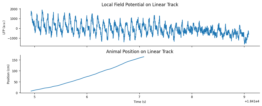
As we would expect, there is a strong theta oscillation dominating the LFP while the animal runs down the track. This oscillation is weaker after the run is complete.
Getting the Wavelet Decomposition#
To illustrate this further, we’ll perform a wavelet decomposition on the LFP trace during this run. We can do this in pynapple using the function nap.compute_wavelet_transform. This function takes the following inputs (in order):
sig: the input signal; aTsd, aTsdFrame, or aTsdTensorfreqs: a 1D array of frequency values to decompose
We will also supply the following optional arguments:
fs: the sampling rate ofsig
A continuous wavelet transform decomposes a signal into a set of wavelets, in this case Morlet wavelets, that span both frequency and time. You can think of the wavelet transform as a cross-correlation between the signal and each wavelet, giving the similarity between the signal and various frequency components at each time point of the signal. Similar to a Fourier transform, this gives us an estimate of what frequencies are dominating a signal. Unlike the Fourier tranform, however, the wavelet transform gives us this estimate as a function of time.
We must define the frequency set that we’d like to use for our decomposition. We can do this with the numpy function np.geomspace, which returns numbers evenly spaced on a log scale. We pass the lower frequency, the upper frequency, and number of samples as positional arguments.
# 100 log-spaced samples between 5Hz and 200Hz
freqs = np.geomspace(5, 200, 100)
We can now compute the wavelet transform on our LFP data during the example run using nap.compute_wavelet_trasform by passing both ex_lfp_run and freqs. We’ll also pass the optional argument fs, which is known to be 1250Hz from the study methods.
sample_rate = 1250
cwt_run = nap.compute_wavelet_transform(ex_lfp_run, freqs, fs=sample_rate)
If fs is not provided, it can be inferred from the time series rate attribute.
print(ex_lfp_run.rate)
1250.0022555092703
The inferred rate is close to the true sampling rate, but it can introduce a small floating-point error. Therefore, it is better to supply the true sampling rate when it is known.
We can visualize the results by plotting a heat map of the calculated wavelet scalogram.
fig, axs = plt.subplots(2, 1, figsize=(10,4), constrained_layout=True, height_ratios=[1.0, 0.3], sharex=True)
fig.suptitle("Wavelet Decomposition")

amp = np.abs(cwt_run.values)
cax = axs[0].pcolormesh(cwt_run.t, freqs, amp.T)
axs[0].set(ylabel="Frequency (Hz)", yscale='log', yticks=freqs[::10], yticklabels=np.rint(freqs[::10]));
axs[0].minorticks_off()
fig.colorbar(cax,label="Amplitude")

p1 = axs[1].plot(ex_lfp_run)
axs[1].set(ylabel="LFP (a.u.)", xlabel="Time(s)")
axs[1].margins(0)
ax = axs[1].twinx()
p2 = ax.plot(ex_position, color="orange")
ax.set_ylabel("Position (cm)")
ax.legend([p1[0], p2[0]],["raw LFP","animal position"])
<matplotlib.legend.Legend at 0x7f2460107790>
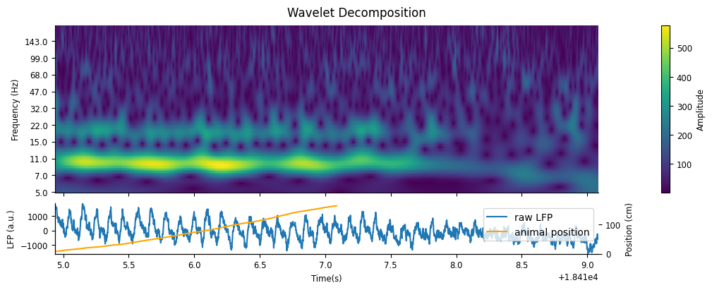
As we would expect, there is a strong presence of theta in the 6-12Hz frequency band while the animal runs down the track, which dampens during rest.
Bonus: Additional signal processing methods#
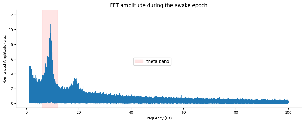
nap.compute_fft
fft_amp = np.abs(nap.compute_fft(lfp_run, fs=sample_rate, norm=True))
fig, ax = plt.subplots(figsize=(10,4), constrained_layout=True)
ax.plot(fft_amp[(fft_amp.index >= 1) & (fft_amp.index <= 100)])
ax.axvspan(6, 12, color="red", alpha=0.1, label = "theta band")
ax.set(xlabel="Frequency (Hz)", ylabel="Normalized Amplitude (a.u.)", title="FFT amplitude during the awake epoch")
fig.legend(loc="center")
<matplotlib.legend.Legend at 0x7f24602bcdd0>
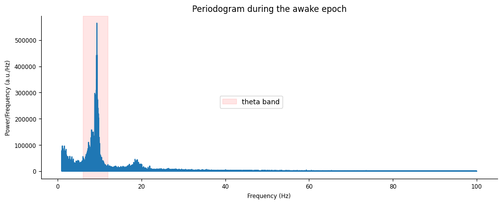
nap.compute_power_spectral_density
power = nap.compute_power_spectral_density(lfp_run, fs=sample_rate)
fig, ax = plt.subplots(figsize=(10,4), constrained_layout=True)
ax.plot(power[(power.index >= 1) & (power.index <= 100)])
ax.axvspan(6, 12, color="red", alpha=0.1, label = "theta band")
ax.set(xlabel="Frequency (Hz)", ylabel="Power/Frequency (a.u./Hz)", title="Periodogram during the awake epoch")
fig.legend(loc="center")
<matplotlib.legend.Legend at 0x7f246029ae10>
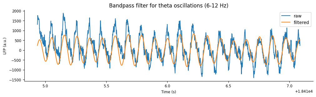
Filtering for theta#
For the remaining exercises, we’ll reduce our example epoch to the portion when the animal is running down the linear track.
ex_run_ep = forward_ep[9]
ex_lfp_run = lfp_run.restrict(ex_run_ep)
ex_position = position.restrict(ex_run_ep)
We can extract the theta oscillation by applying a bandpass filter on the raw LFP. To do this, we use the pynapple function nap.apply_bandpass_filter, which takes the time series as the first argument and the frequency cutoffs as the second argument. Similarly to nap.compute_wavelet_transorm, we can optinally pass the sampling frequency keyword argument fs.
Conveniently, this function will recognize and handle splits in the epoched data (i.e. applying the filtering separately to discontinuous epochs), so we don’t have to worry about passing signals that have been split in time.
Same as before, we’ll pass the optional argument:
fs: the sampling rate ofdatain Hz
Using this function, filter lfp_run within a 6-12 Hz range.
theta_band = nap.apply_bandpass_filter(lfp_run, (6.0, 12.0), fs=sample_rate)
We can visualize the output by plotting the filtered signal with the original signal.
plt.figure(constrained_layout=True, figsize=(10, 3))
plt.plot(ex_lfp_run, label="raw")
plt.plot(theta_band.restrict(ex_run_ep), label="filtered")
plt.xlabel("Time (s)")
plt.ylabel("LFP (a.u.)")
plt.title("Bandpass filter for theta oscillations (6-12 Hz)")
plt.legend();
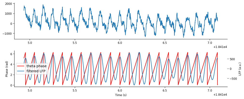
Computing theta phase#
In order to examine phase precession in place cells, we need to extract the phase of theta from the filtered signal. We can do this by taking the angle of the Hilbert transform.
The signal module of scipy includes a function to perform the Hilbert transform, after which we can use the numpy function np.angle to extract the angle.
phase = np.angle(signal.hilbert(theta_band)) # compute phase with hilbert transform
phase
array([-0.89779519, -0.54106433, -0.52196699, ..., -1.57079633,
       -1.57079633, -1.57079633])
The output angle will be in the range \(-\pi\) to \(\pi\). Converting this to a \(0\) to \(2\pi\) range instead, by adding \(2\pi\) to negative angles, will make later visualization more interpretable.
phase[phase < 0] += 2 * np.pi # wrap to [0,2pi]
Finally, we need to turn this into a Tsd to make full use of pynapple’s conveniences! Do this using the time index of theta_band.
theta_phase = nap.Tsd(t=theta_band.t, d=phase)
Let’s plot the phase on top of the filtered LFP signal.
fig,axs = plt.subplots(2,1,figsize=(10,4), constrained_layout=True) #, sharex=True, height_ratios=[2,1])

ax = axs[0]
ax.plot(ex_lfp_run)

ax = axs[1]
p1 = ax.plot(theta_phase.restrict(ex_run_ep), color='r')
ax.set_ylabel("Phase (rad)")
ax.set_xlabel("Time (s)")
ax = ax.twinx()
p2 = ax.plot(theta_band.restrict(ex_run_ep))
ax.set_ylabel("LFP (a.u.)")
ax.legend([p1[0],p2[0]],["theta phase","filtered LFP"])
<matplotlib.legend.Legend at 0x7f2460260810>
Let’s zoom in on a few cycles to get a better look.
fig,ax = plt.subplots(figsize=(10,4), constrained_layout=True) #, sharex=True, height_ratios=[2,1])

ex_run_shorter = nap.IntervalSet(ex_run_ep.start[0], ex_run_ep.start[0]+0.25)

p1 = ax.plot(theta_phase.restrict(ex_run_shorter), color='r')
ax.set_ylabel("Phase (rad)")
ax.set_xlabel("Time (s)")
ax = ax.twinx()
p2 = ax.plot(theta_band.restrict(ex_run_shorter))
ax.set_ylabel("LFP (a.u.)")
ax.legend([p1[0],p2[0]],["theta phase","filtered LFP"])
<matplotlib.legend.Legend at 0x7f24602f5890>
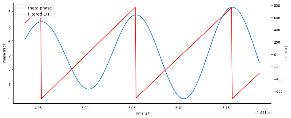
We can see that cycle “resets” (i.e. goes from \(2\pi\) to \(0\)) at peaks of the theta oscillation.
Computing 1D tuning curves: place fields#
In order to identify phase precession in single units, we need to know their place selectivity. We can find place firing preferences of each unit by using the function nap.compute_1d_tuning_curves. This function has the following required inputs:
group: aTsGroupof units for which tuning curves are computedfeature: aTsdor single-columnTsdFrameof the feature over which tuning curves are computed (e.g. position)nb_bins: the number of bins in which to split the feature values for the tuning curve
First, we’ll filter for units that fire at least 1 Hz and at most 10 Hz when the animal is running forward along the linear track. This will select for units that are active during our window of interest and eliminate putative interneurons (i.e. fast-firing inhibitory neurons that don’t usually have place selectivity).
good_spikes = spikes[(spikes.restrict(forward_ep).rate >= 1) & (spikes.restrict(forward_ep).rate <= 10)]
Using these units and the position data, we can compute their place fields using nap.compute_1d_tuning_curves. This function will return a pandas.DataFrame, where the index is the corresponding feature value, and the column is the unit label. Let’s compute this for 50 position bins.
Tip
The reason nap.compute_1d_tuning_curves returns a pandas.DataFrame and not a Pynapple object is because the index corresponds to the feature, where all Pynapple objects assume the index is time.
place_fields = nap.compute_1d_tuning_curves(good_spikes, position, 50)
We can use a subplot array to visualize the place fields of many units simultaneously. Let’s do this for the first 50 units.
from scipy.ndimage import gaussian_filter1d

# smooth the place fields so they look nice
place_fields[:] = gaussian_filter1d(place_fields.values, 1, axis=0)

fig, axs = plt.subplots(10, 5, figsize=(12, 15), sharex=True, constrained_layout=True)
for i, (f, fields) in enumerate(place_fields.iloc[:,:50].items()):
    idx = np.unravel_index(i, axs.shape)
    axs[idx].plot(fields)
    axs[idx].set_title(f)

fig.supylabel("Firing rate (Hz)")
fig.supxlabel("Position (cm)")
Text(0.5, 0.01, 'Position (cm)')
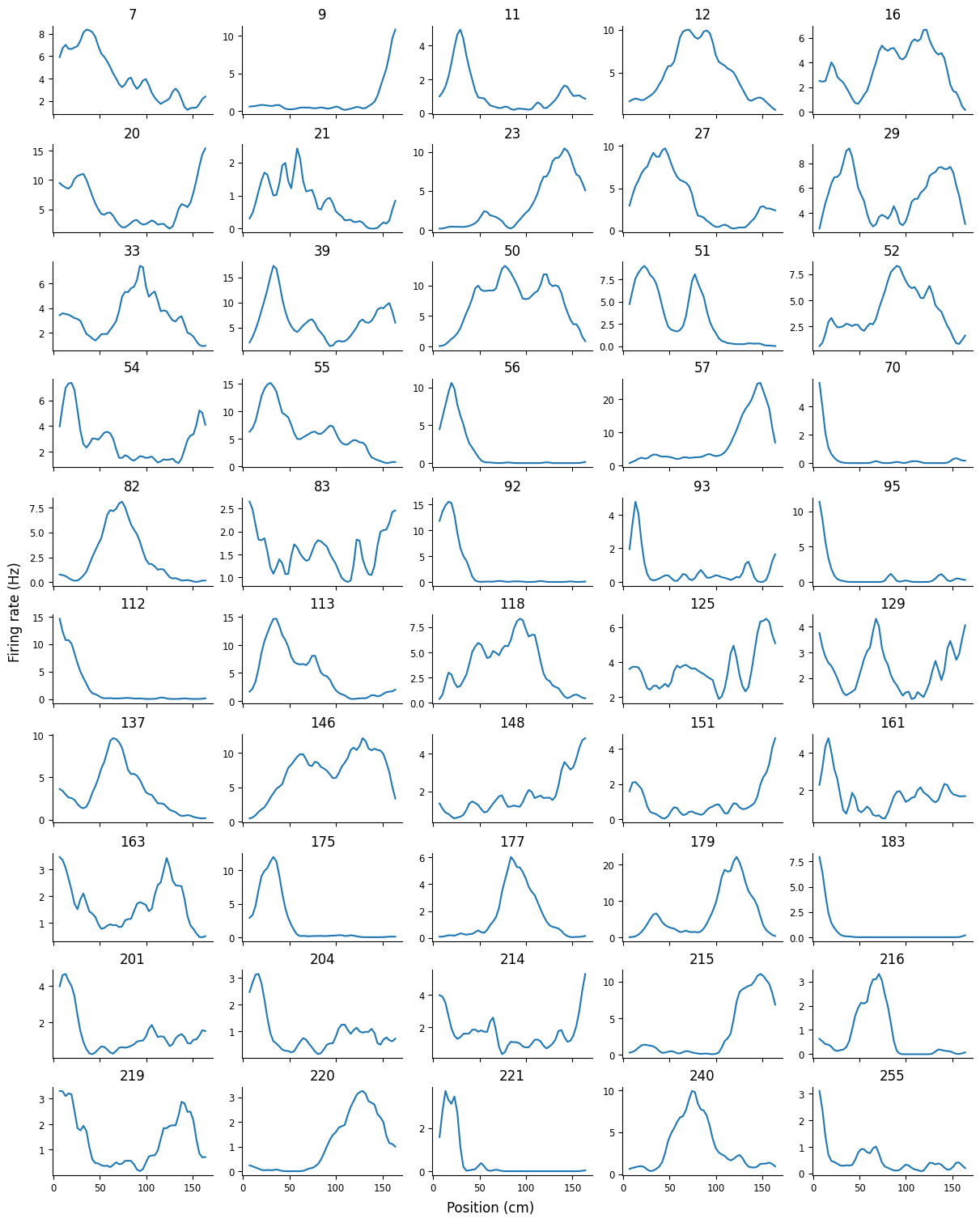
We can see spatial selectivity in each of the units; across the population, we have firing fields tiling the entire linear track.
Visualizing phase precession within a single unit#
As an initial visualization of phase precession, we’ll look at a single traversal of the linear track. First, let’s look at how the timing of an example unit’s spikes lines up with the LFP and theta. To plot the spike times on the same axis as the LFP, we’ll use the pynapple object’s method value_from to align the spike times with the theta amplitude. For our spiking data, this will find the amplitude closest in time to each spike. Let’s start by applying value_from on unit 177, who’s place field is cenetered on the linear track, using theta_band to align the amplityde of the filtered LFP.
unit = 177
spike_theta = spikes[unit].value_from(theta_band)
Let’s plot spike_theta on top of the LFP and filtered theta, as well as visualize the animal’s position along the track.
fig,axs = plt.subplots(2, 1, figsize=(10,4), constrained_layout=True, sharex=True)
axs[0].plot(ex_lfp_run, alpha=0.5, label="raw LFP")
axs[0].plot(theta_band.restrict(ex_run_ep), color="slateblue", label="filtered theta")
axs[0].plot(spike_theta.restrict(ex_run_ep), 'o', color="orange", label="spike times")
axs[0].set(ylabel="LFP (a.u.)")
axs[0].legend()

axs[1].plot(ex_position, '--', color="green", label="animal position")
axs[1].plot(ex_position[(ex_position > 50).values & (ex_position < 130).values], color="green", lw=3, label="place field bounds")
axs[1].set(ylabel="Position (cm)", xlabel="Time (s)")
axs[1].legend()
<matplotlib.legend.Legend at 0x7f2400591bd0>
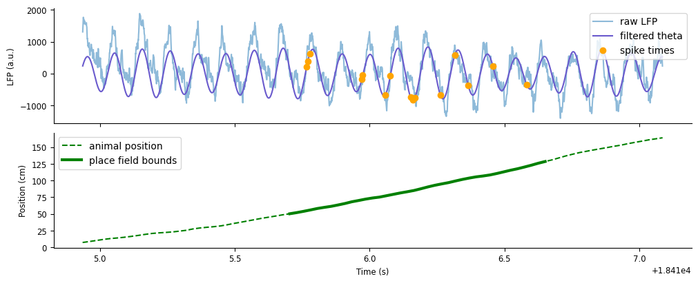
As expected, unit 177 will preferentially spike (orange dots) as the animal runs through the middle of the track (thick green). You may be able to notice that the spikes are firing at specific points in each theta cycle, and these points are systematically changing over time. At first, spikes fire along the rising edge of a cycle, afterwards firing earlier towards the trough, and finally firing earliest along the falling edge.
We can exemplify this pattern by plotting the spike times aligned to the phase of theta. We’ll want the corresponding phase of theta at which the unit fires as the animal is running down the track, which we can again compute using the method value_from.
We can exemplify this pattern by plotting the spike times aligned to the phase of theta. Let’s compute the phase at which each spike occurs by using value_from with theta_phase.
spike_phase = spikes[unit].value_from(theta_phase)
To visualize the results, we’ll recreate the plot above, but instead with the theta phase.
fig,axs = plt.subplots(3, 1, figsize=(10,6), constrained_layout=True, sharex=True)
axs[0].plot(theta_band.restrict(ex_run_ep), color="slateblue", label="filtered theta")
axs[0].plot(spike_theta.restrict(ex_run_ep), 'o', color="orange", label="spike times")
axs[0].set(ylabel="LFP (a.u.)", title="Spike times relative to filtered theta")
axs[0].legend()

axs[1].plot(theta_phase.restrict(ex_run_ep), color="slateblue", label="theta phase")
axs[1].plot(spike_phase.restrict(ex_run_ep), 'o', color="orange", label="spike times")
axs[1].set(ylabel="Phase (rad)", title="Spike times relative to theta phase")
axs[1].legend()

axs[2].plot(ex_position, '--', color="green", label="animal position")
axs[2].plot(ex_position[(ex_position > 50).values & (ex_position < 130).values], color="green", lw=3, label="place field bounds")
axs[2].set(ylabel="Position (cm)", xlabel="Time (s)", title="Animal position")
axs[2].legend()
<matplotlib.legend.Legend at 0x7f24005f2a90>
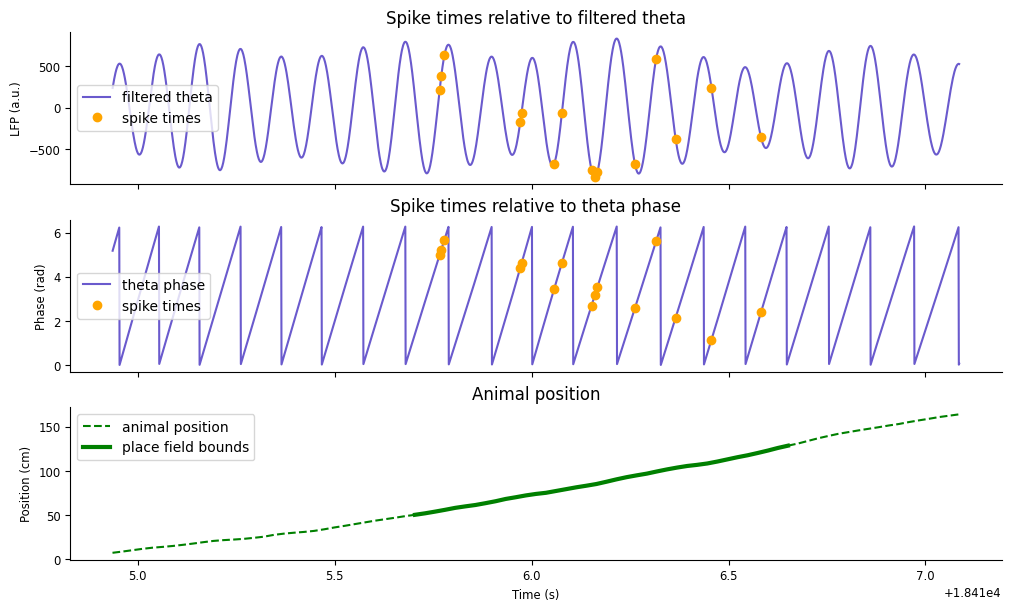
You should now see a negative trend in the spike phase as the animal moves along the track. This phemomena is what is called phase precession: as an animal runs through the place field of a single unit, that unit will spike at late phases of theta (higher radians) in earlier positions in the field, and fire at early phases of theta (lower radians) in late positions in the field.
We can observe this phenomena on average across all runs by relating the spike phase to the spike position. Similar to before, we’ll use the pynapple object method value_from to additionally find the animal position closest in time to each spike.
We can observe this phenomena on average across the session by relating the spike phase to the spike position. Try computing the spike position from what we’ve learned so far.
spike_position = spikes[unit].value_from(position)
Now we can plot the spike phase against the spike position in a scatter plot.
plt.subplots(figsize=(5,3))
plt.plot(spike_position, spike_phase, 'o')
plt.ylabel("Phase (rad)")
plt.xlabel("Position (cm)")
Text(0.5, 0, 'Position (cm)')
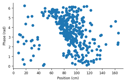
Similar to what we saw in a single run, there is a negative relationship between theta phase and field position, characteristic of phase precession.
Computing 2D tuning curves: position vs. phase#
The scatter plot above can be similarly be represented as a 2D tuning curve over position and phase. We can compute this using the function nap.compute_2d_tuning_curves. This function requires the same inputs as nap.compute_1d_tuning_curves, except now the second input, features, must be a 2-column TsdFrame containing the two target features.
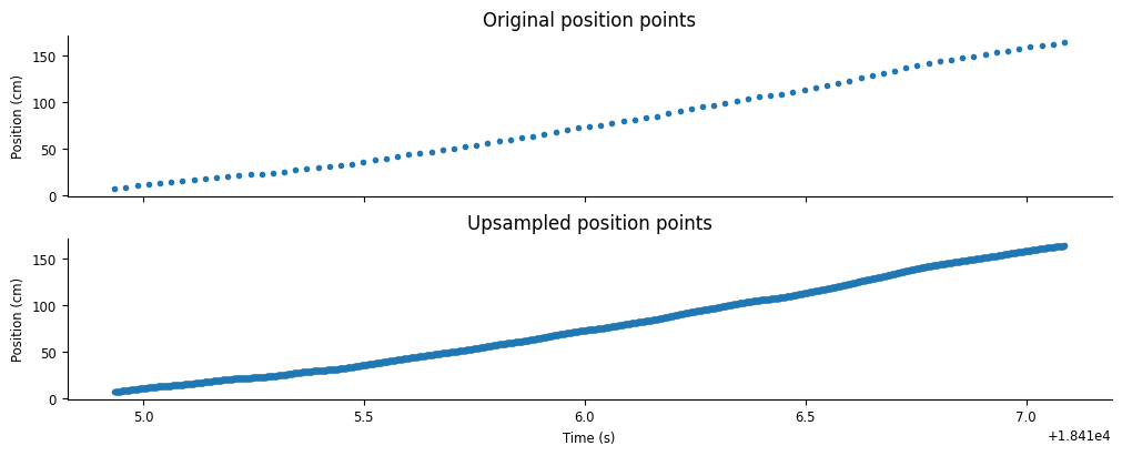
To use this function, we’ll need to combine position and theta_phase into a TsdFrame. To do this, both variables must have the same length. We can achieve this by upsampling position to the length of theta_phase using the pynapple object method interpolate. This method will linearly interpolate new position samples between existing position samples at timestamps given by another pynapple object, in our case by theta_phase.
upsampled_pos = position.interpolate(theta_phase)
Let’s visualize the results of the interpolation.
fig,axs = plt.subplots(2,1,constrained_layout=True,sharex=True,figsize=(10,4))
axs[0].plot(position.restrict(ex_run_ep),'.')
axs[0].set(ylabel="Position (cm)", title="Original position points")
axs[1].plot(upsampled_pos.restrict(ex_run_ep),'.')
axs[1].set(ylabel="Position (cm)", xlabel="Time (s)", title="Upsampled position points")
[Text(0, 0.5, 'Position (cm)'),
 Text(0.5, 0, 'Time (s)'),
 Text(0.5, 1.0, 'Upsampled position points')]
We can now stack upsampled_pos and theta_phase into a single array.
feats = np.stack((upsampled_pos.values, theta_phase.values))
feats.shape
(2, 2412248)
Using feats, we can define a TsdFrame using the time index from theta_phase and the time support from upsampled_pos. Note that feats has the wrong shape; we want time in the first dimension, so we’ll need to pass its transpose.
features = nap.TsdFrame(
    t=theta_phase.t,
    d=np.transpose(feats),
    time_support=upsampled_pos.time_support,
    columns=["position", "theta"],
)
Now we have what we need to compute 2D tuning curves. Let’s apply nap.compute_2d_tuning_curves on our reduced group of units, good_spikes, using 20 bins for each feature.
This function will return two outputs:
A dictionary of the 2D tuning curves, where dictionary keys correspond to the unit label
A list with length 2 containing the feature bin centers
tuning_curves, [pos_x, phase_y] = nap.compute_2d_tuning_curves(good_spikes, features, 20)
We can plot the first 50 2D tuning curves and visualize how many of these units are phase precessing.
fig, axs = plt.subplots(10, 5, figsize=(10, 15), sharex=True, constrained_layout=True)
for i, f in enumerate(list(tuning_curves.keys())[:50]):
    idx = np.unravel_index(i, axs.shape)
    axs[idx].pcolormesh(pos_x, phase_y, tuning_curves[f])
    axs[idx].set_title(f)

fig.supylabel("Phase (rad)")
fig.supxlabel("Position (cm)");
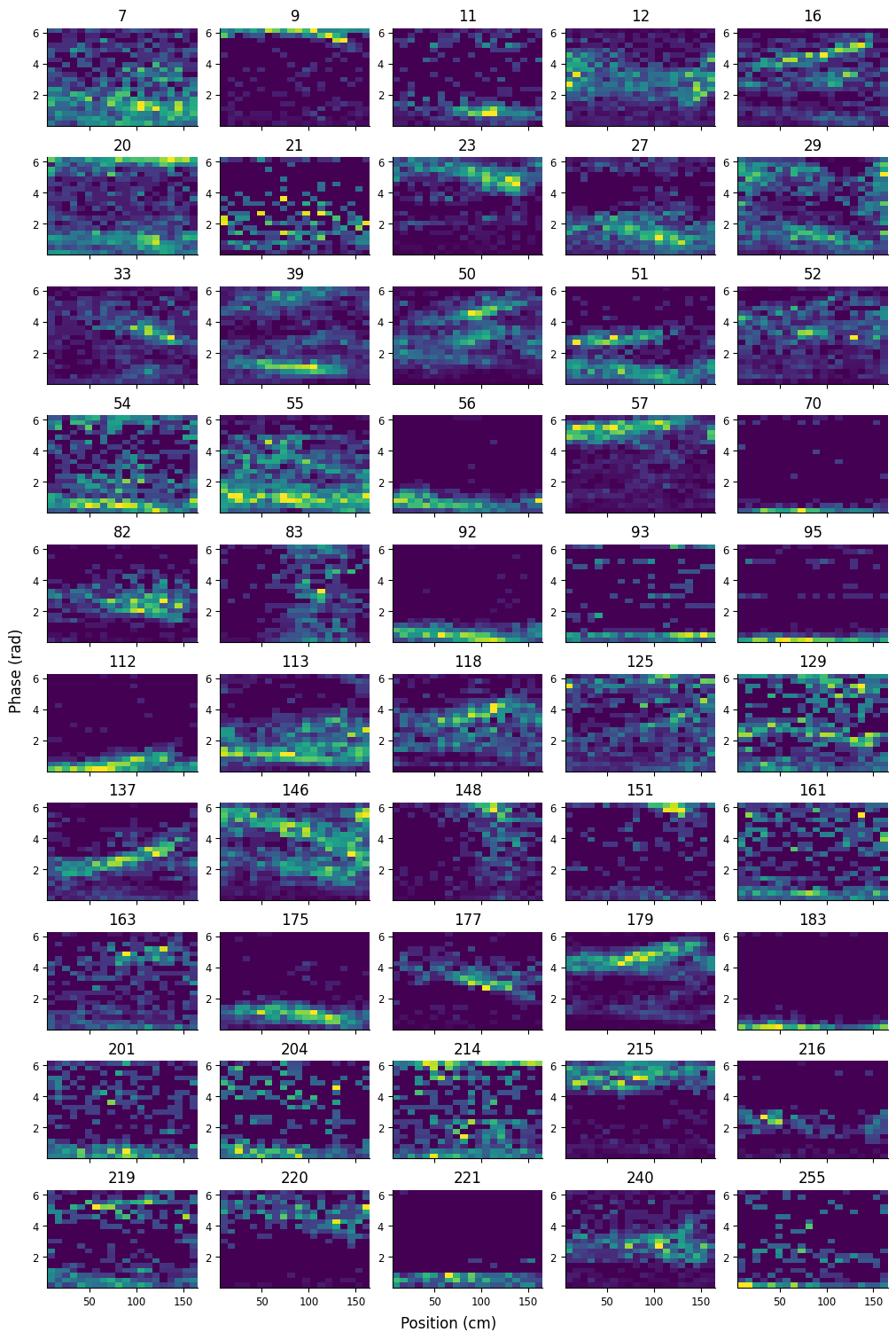
Many of the units display a negative relationship between position and phase, characteristic of phase precession.
Decoding position from spiking activity#
Next we’ll do a popular analysis in the rat hippocampal sphere: Bayesian decoding. This analysis is an elegent application of Bayes’ rule in predicting the animal’s location (or other behavioral variables) from neural activity at some point in time.
Background#
Recall Bayes’ rule, written here in terms of our relevant variables:
Our goal is to compute the unknown posterior \(P(position|spikes)\) given known prior \(P(position)\) and known likelihood \(P(spikes|position)\).
\(P(position)\), also known as the occupancy, is the probability that the animal is occupying some position. This can be computed exactly by the proportion of the total time spent at each position, but in many cases it is sufficient to estimate the occupancy as a uniform distribution, i.e. it is equally likely for the animal to occupy any location.
The next term, \(P(spikes|position)\), which is the probability of seeing some sequence of spikes across all neurons at some position. Computing this relys on the following assumptions:
Neurons fire according to a Poisson process (i.e. their spiking activity follows a Poisson distribution)
Neurons fire independently from one another.
While neither of these assumptions are strictly true, they are generally reasonable for pyramidal cells in hippocampus and allow us to simplify our computation of \(P(spikes|position)\)
The first assumption gives us an equation for \(P(spikes|position)\) for a single neuron, which we’ll call \(P(spikes_i|position)\) to differentiate it from \(P(spikes|position) = P(spikes_1,spikes_2,...,spikes_i,...,spikes_N|position) \), or the total probability across all \(N\) neurons. The equation we get is that of the Poisson distribution: $\( P(spikes_i|position) = \frac{(\tau f_i(position))^n e^{-\tau f_i(position)}}{n!} \)\( where \)f_i(position)\( is the firing rate of the neuron at position \)(position)\( (i.e. the tuning curve), \)\tau\( is the width of the time window over which we're computing the probability, and \)n$ is the total number of times the neuron spiked in the time window of interest.
The second assumptions allows us to simply combine the probabilities of individual neurons. Recall the product rule for independent events: \(P(A,B) = P(A)P(B)\) if \(A\) and \(B\) are independent. Treating neurons as independent, then, gives us the following: $\( P(spikes|position) = \prod_i P(spikes_i|position) \)$
The final term, \(P(spikes)\), is inferred indirectly using the law of total probability:
Another way of putting it is \(P(spikes)\) is the normalization factor such that \(\sum_{position} P(position|spikes) = 1\), which is achived by dividing the numerator by its sum.
If this method looks daunting, we have some good news: pynapple has it implemented already in the function nap.decode_1d for decoding a single dimension (or nap.decode_2d for two dimensions). All we’ll need are the spikes, the tuning curves, and the width of the time window \(\tau\).
ASIDE: Cross-validation#
Generally this method is cross-validated, which means you train the model on one set of data and test the model on a different, held-out data set. For Bayesian decoding, the “model” refers to the model likelihood, which is computed from the tuning curves.
We want to decode the example run we’ve been using throughout this exercise; therefore, our training set should omit this run before computing the tuning curves. We can do this by using the IntervalSet method set_diff, to take out the example run epoch from all run epochs. Next, we’ll restrict our data to these training epochs and re-compute the place fields using nap.compute_1d_tuning_curves. We’ll also apply a Gaussian smoothing filter to the place fields, which will smooth our decoding results down the line.
Important
Generally this method is cross-validated, which means you train the model on one set of data and test the model on a different, held-out data set. For Bayesian decoding, the “model” refers to the model likelihood, which is computed from the tuning curves. Run the code below if you want to use a separate training set to compute the tuning curves.
# hold out trial from place field computation
run_train = forward_ep.set_diff(ex_run_ep)
# get position of training set
position_train = position.restrict(run_train)
# compute place fields using training set
place_fields = nap.compute_1d_tuning_curves(spikes, position_train, nb_bins=50)
# smooth place fields
place_fields[:] = gaussian_filter1d(place_fields.values, 1, axis=0)
Run 1D decoder#
With a single dimension in our tuning curves (position), we can apply Bayesian decoding using the function nap.decode_1d. This function requires the following inputs:
tuning_curves: apandas.DataFrame, computed bynap.compute_1d_tuning_curves, with the tuning curves relative to the feature being decodedgroup: aTsGroupof spike times, or aTsdFrameof spike counts, for each unit intuning_curves.ep: anIntervalSetcontaining the epoch to be decodedbin_size: the time length, in seconds, of each decoded bin. Ifgroupis aTsGroupof spike times, this determines how the spikes are binned in time. Ifgroupis aTsdFrameof spike counts, this should be the bin size used for the counts.
This function will return two outputs:
a
Tsdcontaining the decoded feature at each decoded time pointa
TsdFramecontaining the decoded probability of each feature value at each decoded time point, where the column names are the corresponding feature values
Let’s decode position during ex_run_ep using 40 ms time bins.
decoded_position, decoded_prob = nap.decode_1d(place_fields, spikes, ex_run_ep, 0.04)
Let’s plot decoded position with the animal’s true position. We’ll overlay them on a heat map of the decoded probability to visualize the confidence of the decoder.
fig,ax = plt.subplots(figsize=(10, 4), constrained_layout=True)
c = ax.pcolormesh(decoded_position.index,place_fields.index,np.transpose(decoded_prob))
ax.plot(decoded_position, "--", color="red", label="decoded position")
ax.plot(ex_position, color="red", label="true position")
ax.legend()
fig.colorbar(c, label="decoded probability")
ax.set(xlabel="Time (s)", ylabel="Position (cm)", );
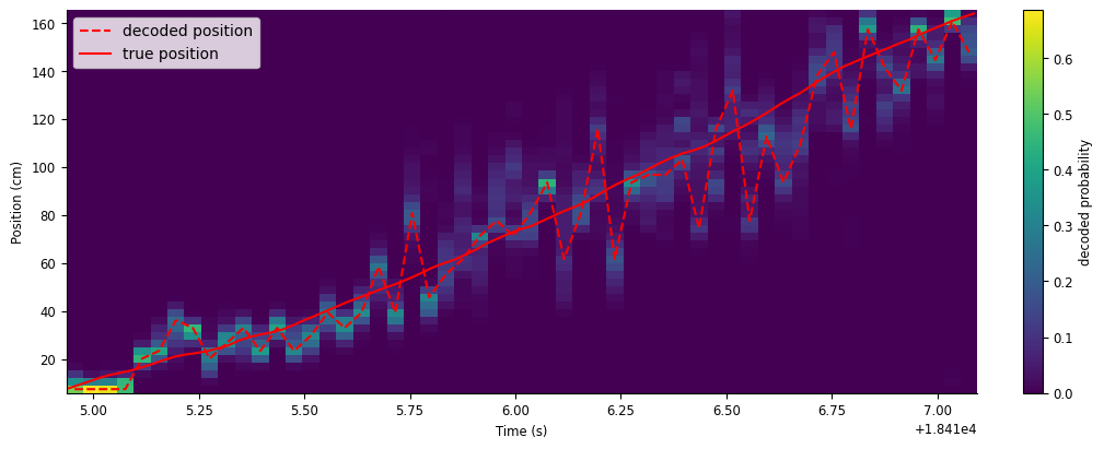
While the decoder generally follows the animal’s true position, there is still a lot of error in the decoder, especially later in the run. In the next section, we’ll show how to improve our decoder estimate.
Smooth spike counts#
One way to improve our decoder is to supply smoothed spike counts to nap.decode_1d. We can smooth the spike counts by convolving them with a kernel of ones; this is equivalent to applying a moving sum to adjacent bins, where the length of the kernel is the number of adjacent bins being added together. You can think of this as counting spikes in a sliding window that shifts in shorter increments than the window’s width, resulting in bins that overlap. This combines the accuracy of using a wider time bin with the temporal resolution of a shorter time bin.
For example, let’s say we want a sliding window of \(200 ms\) that shifts by \(40 ms\). This is equivalent to summing together 5 adjacent \(40 ms\) bins, or convolving spike counts in \(40 ms\) bins with a length-5 array of ones (\([1, 1, 1, 1, 1]\)). Let’s visualize this convolution.
ex_counts = spikes[unit].restrict(ex_run_ep).count(0.04)
workshop_utils.animate_1d_convolution(ex_counts, np.ones(5), tsd_label="original counts", kernel_label="moving sum", conv_label="convolved counts")
The count at each time point is computed by convolving the kernel (yellow), centered at that time point, with the original spike counts (blue). For a length-5 kernel of ones, this amounts to summing the counts in the center bin with two bins before and two bins after (shaded green, top). The result is an array of counts smoothed out in time (green, bottom).
Let’s compute the smoothed counts for all units. If we want a sliding window of \(200 ms\) shifted by \(40 ms\), we’ll need to first count the spikes in \(40 ms\) bins. We only need the counts for the epoch we want to decode, so we will use spikes restricted to ep_run_ep.
On spike times restricted to
ep_run_ep, count spikes in \(40 ms\) bins using the pynapple object methodcount.
counts = spikes.restrict(ex_run_ep).count(0.04)
Now, we need to sum each set of 5 adjacent bins to get our full window width of \(200 ms\). We can compute this by using the pynapple object method convolve with the kernel np.ones(5).
smth_counts = counts.convolve(np.ones(5))
Now we can use nap.decode_1d again with our smoothed counts in place of the raw spike times. Note that the bin size we’ll want to provide is \(200 ms\), since this is the true width of each bin.
smth_decoded_position, smth_decoded_prob = nap.decode_1d(place_fields, smth_counts, ex_run_ep, bin_size=0.2)
Let’s plot the results.
fig,ax = plt.subplots(figsize=(10, 4), constrained_layout=True)
c = ax.pcolormesh(smth_decoded_position.index,place_fields.index,np.transpose(smth_decoded_prob))
ax.plot(smth_decoded_position, "--", color="red", label="decoded position")
ax.plot(ex_position, color="red", label="true position")
ax.legend()
fig.colorbar(c, label="decoded probability")
ax.set(xlabel="Time (s)", ylabel="Position (cm)", );
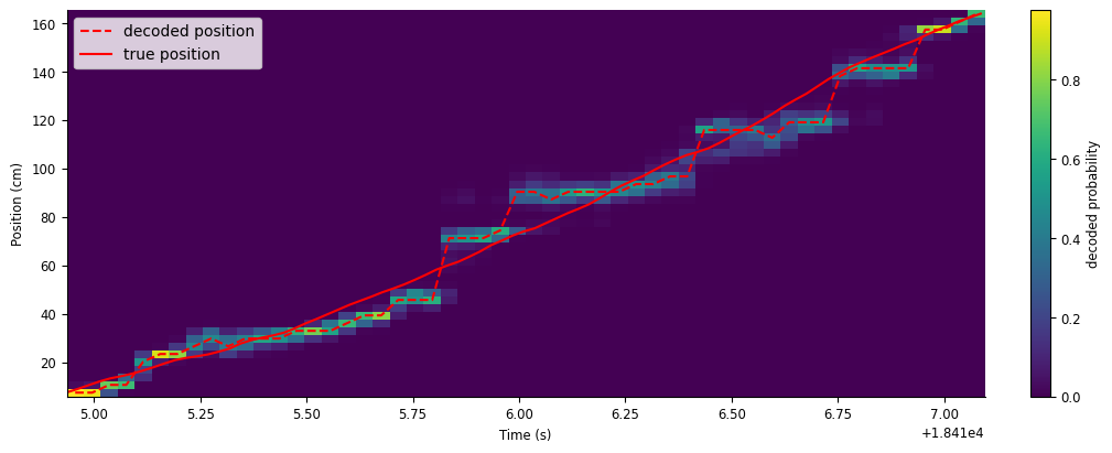
This gives us a much closer approximation of the animal’s true position.
Decoding theta sequences#
Units phase precessing together creates fast, spatial sequences around the animal’s true position. We can reveal this by decoding at an even shorter time scale, which will appear as smooth errors in the decoder.
Let’s repeat what we did above, but now with a \(50 ms\) sliding window that shifts by \(10 ms\).
counts = spikes.restrict(ex_run_ep).count(0.01)
smth_counts = counts.convolve(np.ones(5))
smth_decoded_position, smth_decoded_prob = nap.decode_1d(place_fields, smth_counts, ex_run_ep, bin_size=0.05)
We’ll make the same plot as before to visualize the results, but plot it alongside the raw and filtered LFP.
fig, axs = plt.subplots(2, 1, figsize=(10, 4), constrained_layout=True, height_ratios=[3,1], sharex=True)
c = axs[0].pcolormesh(smth_decoded_prob.index, smth_decoded_prob.columns, np.transpose(smth_decoded_prob))
p1 = axs[0].plot(smth_decoded_position, "--", color="r")
p2 = axs[0].plot(ex_position, color="r")
axs[0].set_ylabel("Position (cm)")
axs[0].legend([p1[0],p2[0]],["decoded position","true position"])
fig.colorbar(c, label = "predicted probability")

axs[1].plot(ex_lfp_run)
axs[1].plot(theta_band.restrict(ex_run_ep))
axs[1].set_ylabel("LFP (a.u.)")

fig.supxlabel("Time (s)");
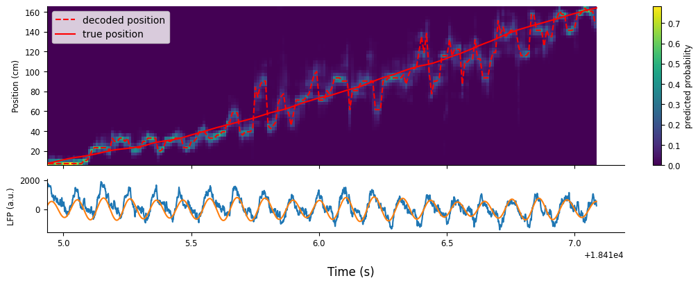
The estimated position oscillates with cycles of theta, where each “sweep” is referred to as a “theta sequence”. Fully understanding the properties of theta sequences and their role in learning, memory, and planning is an active topic of research in Neuroscience!